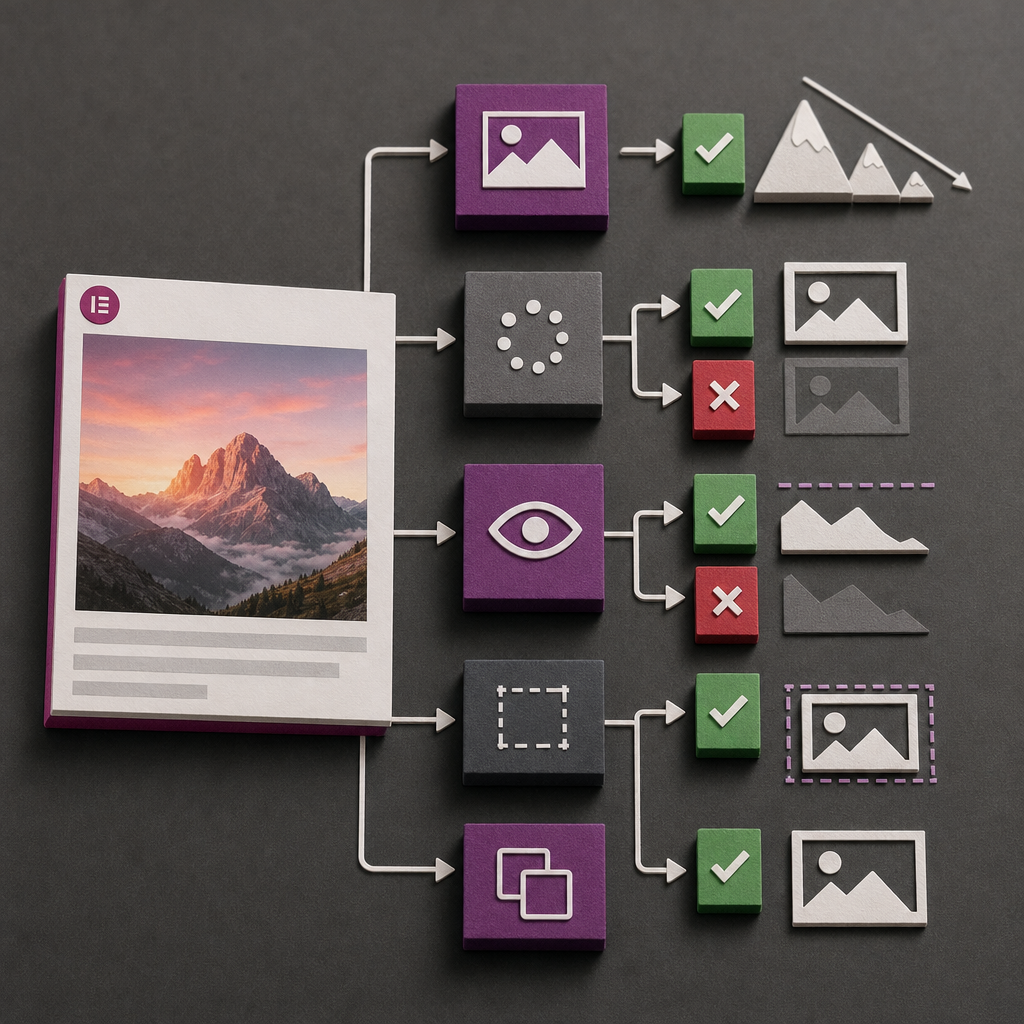
The main above-the-fold image often determines how quickly users see the primary content on a page. In PageSpeed Insights or Lighthouse reports, it may be identified as the Largest Contentful Paint, or the largest visible element that loads in the upper part of the page.
In Elementor, delays most often occur when the hero image is set as a container background, receives lazy loading, or is loaded at an unnecessarily large size. Below is a practical approach to optimization without sacrificing quality or responsive behavior.
What Is an LCP Image and Why Does It Load Slowly?
LCP is a Core Web Vitals metric that shows when the largest content element in the visible area becomes available. On a page with a large banner, this is often the image, a heading with a background, or a video preview. That is why optimizing the hero section can have a noticeable effect on the perceived speed of a website.
An image may appear late for several reasons: the browser discovers its URL too late in CSS, the file has excessive resolution, the server responds slowly, the image is incorrectly deferred through lazy loading, or a third-party plugin changes how it loads.
A container background image is not automatically slow, but it can be more difficult for the browser to prioritize than a regular img element in the HTML markup. For the main visual element of a page, it is usually better to use the Image widget when the design allows it.
- Check which exact element is identified as LCP in the Lighthouse or PageSpeed Insights report.
- Do not optimize blindly: if the LCP element is a heading, video, or text block, the problem may not be the image.
- Check the mobile version separately: slow connections and less powerful devices make unnecessary requests more noticeable.
Why Consider the Image Widget for the Hero Section?
When the main image is added through the Image widget, it becomes part of the page’s HTML markup. WordPress can generate responsive srcset and sizes attributes, allowing the browser to choose a file that matches the width of the particular screen. This is better than always delivering one large original file.
The Image widget also provides more explicit control over alternative text, dimensions, and image behavior across devices. For a photograph, illustration, or cover image that is part of the content, it is generally a more logical choice than a background.
A background remains appropriate when the image is decorative, needs text layered over it, or must be cropped using background-size: cover. In that case, make sure the file is not loaded late and that its dimensions match the way it is actually displayed.
- For a content-based hero image, use the Image widget when this does not conflict with the layout.
- Do not add the same image both as a background and through the Image widget.
- Do not create separate desktop and mobile versions without a clear need: a hidden element may still generate an additional request in some cases.
- If different crops are required for mobile and desktop screens, check the actual browser behavior and the number of resources being loaded.
How to Choose the Right File Size and Format
An original image that is 4,000 pixels wide is rarely necessary for a hero section displayed at around 1,200–1,600 pixels. An oversized file increases loading time, bandwidth consumption, and the load placed on mobile devices. Base the image on its maximum actual display width, with a small allowance for high-density screens, rather than on the original file size.
WebP or AVIF is usually suitable for photographs if the site’s server, WordPress setup, and browsers support these formats correctly. For simple illustrations, logos, and images with transparency, the format should be chosen separately: SVG or PNG may sometimes be more appropriate. The format alone will not solve the problem if the file contains unnecessary pixels or uses excessive compression quality.
After replacing the file, check not only the visual quality but also the actual resource in DevTools. The browser may load a different version than expected if an optimization plugin, CDN, or cache is serving old data.
- Prepare the image for the section’s actual width instead of uploading the original camera file.
- Use compression that does not introduce noticeable artifacts in important details.
- Make sure WordPress generates available responsive image sizes.
- Do not convert a logo or illustration to a format that reduces transparency or sharpness.
- Clear the cache after replacing the file; otherwise, the test may still show the old version.
Lazy Loading, Priority, and Initial Requests
Lazy loading is useful for images located below the first screen. The browser does not load them immediately, allowing the page to prioritize resources for visible content. However, applying lazy loading to an image visible as soon as the page opens can make LCP worse.
Check whether Elementor, WordPress, or an optimization plugin has added the lazy loading attribute to the hero image. Names and available settings may vary depending on the system version and installed extensions, so rely on the actual HTML and network requests rather than the editor settings alone.
Do not add preload to every large image without careful consideration. An incorrect preload can compete with fonts, CSS, and other critical resources. It makes sense only when you understand which resource is critical and why the browser is not discovering it early enough.
- For a hero image visible immediately, disable lazy loading if it has been applied incorrectly.
- For images below the first screen, lazy loading is generally worth keeping enabled.
- Check the waterfall in the Network tab: when the image starts loading and how long the response takes.
- Do not use multiple optimization features at the same time if they all change lazy loading or resource priority.
- After making changes, test the page with caching disabled or after clearing the cache.
How to Prevent CLS Caused by Image Dimensions
Even a fast image can harm the user experience if it changes the height of the hero section after loading. The text, buttons, and other elements then shift position, creating Cumulative Layout Shift.
To prevent this, the browser must know the image proportions before it loads. For an Image widget, use correct width and height values or define the aspect ratio through the container settings or aspect-ratio. For a background, set the section height or minimum height in advance so it matches the layout.
Do not choose a height by eye for only one device. Check how the hero section behaves on narrow screens, in portrait orientation, and with increased font size.
- Preserve the correct width-to-height ratio of the original image.
- Do not rely on an empty container whose height appears only after the image loads.
- Check whether fonts, headings, or buttons change the height of the section after loading.
- Review the page separately on a mobile device, where hero proportions often differ.
Step-by-Step LCP Testing in Elementor
Start by testing the published page rather than only viewing it in the Elementor editor. The editor may load additional resources that a regular visitor does not use. For an objective check, use PageSpeed Insights, Lighthouse, or Chrome DevTools.
First, identify the LCP element. If it is an image, check its URL, format, file size, loading attributes, and the actual time when loading begins. Then check for a duplicate at another breakpoint, a hidden background image, or a repeated request from CSS.
After every change, clear the page cache, the optimization plugin cache, and the CDN cache if one is being used. Compare not only the score but also field data when available: a single lab test may differ from the real experience of users.
- Find the LCP element in the report.
- Check whether the hero image loads without lazy loading.
- Compare the actual display width with the width of the loaded file.
- Check the format, file size, caching, and server response time.
- Make sure that images below the fold are not loading before the main content.
- Repeat the test on desktop and mobile after clearing the cache.
Common Mistakes
The most common mistake is optimizing all images in the same way. A hero image and an image at the bottom of the page serve different purposes: the first needs to start loading quickly, while the latter generally benefits from deferred loading and a lower priority.
Problems also arise when a developer compresses a file but leaves its resolution unnecessarily high, or disables lazy loading for every image on the site. This may speed up one element while increasing the number of initial requests.
- Do not keep a background for the hero out of habit if the image is an important part of the content.
- Do not use a 4,000 px original for a section that needs only about 1,200 px.
- Do not hide duplicates with CSS without checking whether they are actually prevented from loading.
- Do not judge the result only by the score: analyze LCP, CLS, the waterfall, and image quality.
Frequently asked questions
Should a background always be replaced with the Image widget?
No. If a background is needed for decorative styling, text overlays, or complex cropping, it can remain in place. However, for a primary content image, the Image widget often gives the browser a clearer HTML structure and better responsive loading options.
Should lazy loading be disabled for every image on the page?
No. Disable it only for an image that is visible immediately and may be the LCP element. Images below the first screen are generally better loaded lazily.
What size should an LCP image be?
There is no universal value. The file should match the maximum actual display width with a small allowance, but it should not be an unnecessarily large original several thousand pixels wide. Check the resource actually loaded on desktop and mobile.
Will WebP or AVIF help if LCP is still slow?
It may help if the new format significantly reduces the file size. However, the problem may remain because of lazy loading, a slow server, late discovery of a background image, duplicate resources, or blocking critical resources. The format should be evaluated together with the entire loading chain.
Why did the PageSpeed score not change after optimization?
The result may depend on the cache, testing conditions, server, and other page resources. Check that the published version is being tested, the cache has been cleared, and that the LCP element and the time when its loading begins have actually changed.
Conclusion
Optimizing an LCP image in Elementor starts not with mechanically compressing the file, but with identifying which element actually creates the LCP. For a hero section, it is often worth using an Image widget instead of a background, choosing an appropriate size and format, disabling incorrectly applied lazy loading, and reserving space for the image in advance.
After making changes, check the page on desktop and mobile, analyze network requests, and make sure the optimization has not introduced new CLS issues or unnecessary loading. This approach helps speed up the first screen without compromising responsive behavior or visual quality.