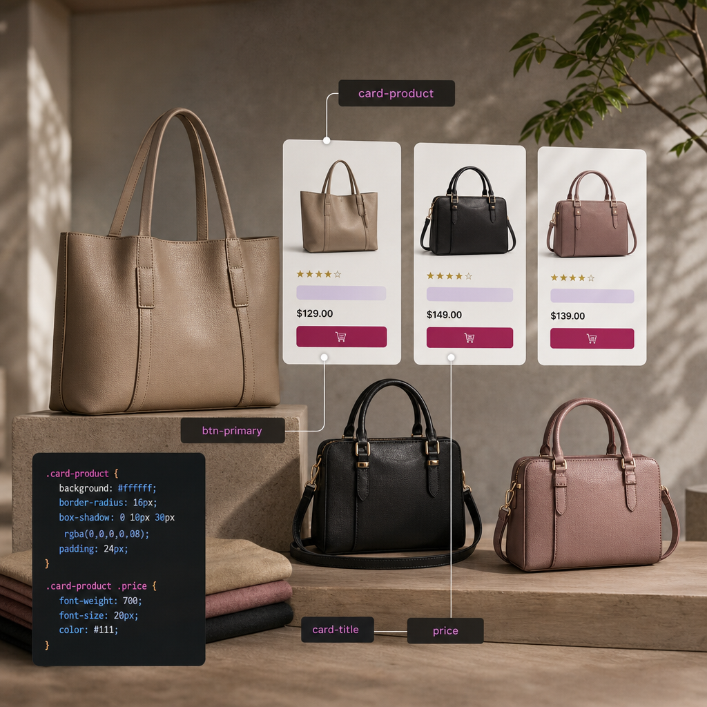
If your website uses the same buttons, cards, headings, or information blocks in multiple places, you do not need to configure each widget separately. In Elementor, you can assign one CSS class to multiple elements and control their appearance from a single place.
This approach reduces duplicated styles, simplifies page editing, and helps maintain a consistent design. Below, we will cover how to add classes, where to write CSS, how to create a clear naming system, and what to do when a style is not applied.
What Is a Shared CSS Class in Elementor?
A CSS class is a name that can be assigned to one or more HTML elements. The browser then applies the same styling rules to every element with that name.
For example, you can use the class card-title for the headings of all product cards and button-outline for buttons with an outline. If you later need to change the color or font size, you only need to edit one CSS rule.
- One class can be assigned to any number of widgets.
- Styles are stored centrally.
- The amount of repeated CSS is reduced.
- It is easier to maintain a consistent appearance for components.
- Changes can be implemented more quickly across multiple pages.
How to Add a CSS Class to an Elementor Element
Open the required page in the Elementor editor and select the widget, container, or other element you want to style. Go to the Advanced tab and find the CSS Classes field. Enter the class name without a dot at the beginning.
For example, you can enter card-title for card headings and btn-primary for buttons. If there are several elements, repeat the same name in each element's CSS Classes field.
You can enter multiple classes in one field, separated by spaces. This lets you combine a base style with a modifier, such as card and card-featured.
- Correct in the Elementor field: card-title
- Correct in CSS: .card-title
- Incorrect in the Elementor field: .card-title
- Do not use spaces within a single class name.
Where to Write CSS for a Shared Class
You can add CSS wherever it best fits your WordPress and Elementor configuration. If Custom CSS is available in your version of Elementor, you can place the rules in the site settings or another section provided for this purpose. The theme's CSS in WordPress's additional styles section is also commonly used.
For styles that apply across the entire site, a global location is convenient. If a rule is needed only for one page or component, it is better to limit it to the relevant container or add it to local CSS if that option is available.
A class in CSS always begins with a dot. For example:
- Global components — in the site's general styles.
- A unique block — in the styles for a specific page or section.
- Major changes — preferably stored in a child theme or a controlled stylesheet so they are not lost during updates.
.card-title {
  color: #222;
  font-size: 24px;
  font-weight: 700;
}

.btn-primary {
  background-color: #1769e0;
  color: #fff;
  border-radius: 6px;
  padding: 12px 20px;
}
Examples of Shared Classes for Common Components
Shared classes work best for reusable components that have the same purpose and a similar HTML structure. Before creating a rule, determine what should be shared: color, spacing, typography, borders, or hover behavior.
For more complex components, you can use a base class and additional modifiers. For example, all cards can receive the card class, while a featured card can also receive card-featured.
- section-hero — the main screen or hero section.
- card-product — a product card.
- card-title — a card heading.
- button-outline — an outlined button.
- text-muted — secondary text.
- icon-circle — an icon inside a circular wrapper.
.card {
  background: #fff;
  border: 1px solid #e5e7eb;
  border-radius: 12px;
  padding: 24px;
}

.card-featured {
  border-color: #1769e0;
  box-shadow: 0 8px 24px rgba(23, 105, 224, 0.12);
}

.card .card-title {
  margin-bottom: 12px;
}
How to Name Classes and Organize Styles
A class name should describe an element's role or purpose rather than its temporary appearance. For example, product-card is more useful than white-box because the color may change while the component's purpose remains the same.
For larger websites, it is worth agreeing on a naming format in advance. You can use hyphens and a clear structure: component, component-element, and component-modifier. The most important thing is to follow the same approach across all templates.
Do not use IDs for group styling. IDs must be unique on a page and are more often used for anchors, navigation, or individual special elements. Classes are intended for reusable components.
- Use Latin letters, numbers, and hyphens.
- Do not begin a name with a number.
- Do not name a class only after its color or current size.
- Do not create many nearly identical names for the same component.
- Keep a short list of the main classes in the project documentation.
Responsive Behavior and CSS Specificity
A shared class applies at all screen sizes unless you override it with a media query. Therefore, test the component on mobile, tablet, and desktop layouts. For example, a large card heading may need a smaller font size on a phone.
Sometimes a style is not visible because Elementor or the theme has rules with higher specificity. In that case, first check the loading order and selectors in your browser's developer tools. Do not immediately add !important: excessive use makes future editing more difficult.
For a more precise rule, you can attach the class to a parent component, but do this only when necessary. Selectors that are too long become fragile if the page structure changes.
- Check spacing and font sizes on narrow screens.
- Use media queries for mobile-specific changes.
- Do not duplicate the same rules for every widget.
- After clearing the cache, check the page in a private browser window.
@media (max-width: 767px) {
  .card-title {
    font-size: 20px;
  }

  .btn-primary {
    width: 100%;
  }
}
Common Mistakes and How to Check the Result
If a class does not work, check its spelling in Elementor and in the CSS. The most common causes are an extra dot, an accidental space, a mistake in the name, unsaved changes, or caching. The names card-title and card_title represent different classes.
Also make sure the class was added to the correct element. In Elementor, the style may be assigned to a container, heading, inner wrapper, or button, and the result will depend on which HTML element actually received the class.
After publishing, open the page as a regular visitor and check several instances of the component. Make sure the change has not affected elements that use the same class but serve a different purpose.
- Check that there is no dot in the CSS Classes field.
- Compare the class name in Elementor with the name in the stylesheet.
- Make sure the CSS syntax includes curly braces and semicolons.
- Clear the cache of your plugin, CDN, or browser after making changes.
- Check whether another rule is overriding your style.
Frequently asked questions
Can I add one CSS class to multiple Elementor widgets?
Yes. Enter the same class name without a dot in the CSS Classes field of each required widget. They will all receive the styles from the .class-name rule.
How is a CSS class different from an ID?
A class can be reused for a group of elements. An ID must be unique and is generally used for anchors, navigation, or special scripts.
Why is the class style not being applied?
Check the spelling of the name, the dot in the CSS selector, the correct target element, saved changes, caching, and the specificity of other rules. The Styles tab in your browser's developer tools is useful for troubleshooting.
Can I combine multiple classes in one widget?
Yes. Enter the names separated by a space, for example card card-featured. The first class can contain the base styles, while the second contains only the differences for a specific variation.
Conclusion
Shared CSS classes help turn a collection of individually configured Elementor widgets into a manageable component system. Add a class to all similar elements, define its styles in one place, and use modifiers only where a variation is needed.
Clear names, moderate specificity, and regular responsive testing will make your CSS more predictable. As a result, design changes can be implemented faster, and WordPress pages remain easier to maintain.