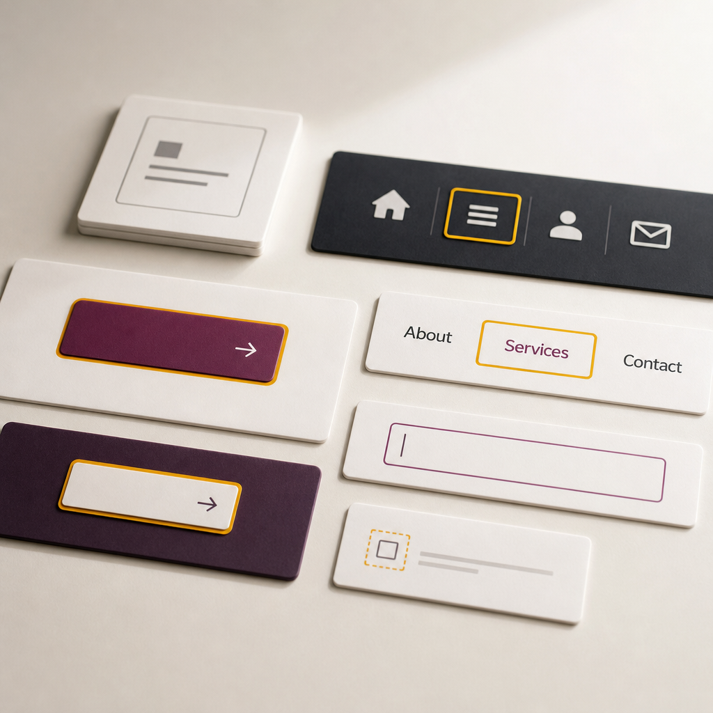
Users who cannot or do not want to use a mouse navigate websites with the Tab key. To make this navigation clear, the active link, button, or other interactive element must have a noticeable visual focus state.
Problems arise when a theme or Elementor styles remove the default outline with the outline: none rule. As a result, keyboard users press Tab but cannot see where the focus is. Below, we explain how to add a clean focus-visible style in Elementor, where to place the CSS, and how to check the result.
What Is Focus and Why Is It Important?
Focus is the state of the element that is currently ready to receive a keyboard action. For example, after you press Tab, focus moves to a button, link, form field, or menu item. The user can then press Enter or Space to perform an action without a mouse.
Visually, focus is usually shown with an outline, color change, shadow, or another clear marker. Without this marker, navigation becomes like searching for an element at random. This creates difficulties not only for people with visual impairments, but also for those using a laptop without a mouse or accessing a site in inconvenient conditions.
The :focus-visible pseudo-class makes it possible to display focus styles mainly when the browser detects keyboard navigation. After a normal mouse click, a prominent outline usually does not appear, so the interface does not look unnecessarily cluttered.
- Tab moves focus forward between available elements.
- Shift + Tab moves focus backward.
- Enter activates a link or button.
- Space activates a button and some other controls.
How to Add focus-visible in Elementor Pro
In Elementor Pro, you can add CSS at the level of a button, link, widget, or container through the Custom CSS field in the Advanced tab. The exact panel layout may vary depending on your Elementor version and the type of element selected, so look for the Custom CSS field in the settings of the relevant component.
An Elementor button is usually implemented as an a element, so use the selector selector a. If the selected widget contains a real HTML button, selector button will work. Add the following code:
- Open the page in Elementor.
- Select the button, link, or container for which you want to configure focus.
- Go to Advanced → Custom CSS, if this option is available in your version of Elementor Pro.
- Paste in the CSS and save the page.
- Clear the site and browser caches if the old styles continue to appear.
selector a:focus-visible,
selector button:focus-visible {
  outline: 3px solid #ffb400;
  outline-offset: 4px;
  border-radius: 4px;
}
When Focus Should Be Applied to the Element Itself
In most Elementor widgets, the interactive part is a child link, so selector a is a practical option. However, focus is sometimes applied to the root element itself or to a different HTML structure. In that case, you can try selector:focus-visible or inspect the element structure using your browser’s developer tools.
- If the outline does not appear, check which exact HTML element receives focus.
- Do not add several conflicting outline rules to the same component at the same time.
- The selector keyword works in Elementor Custom CSS as a reference to the current element or widget.
selector:focus-visible {
  outline: 3px solid #ffb400;
  outline-offset: 4px;
  border-radius: 4px;
}
How to Choose the Outline Color, Thickness, and Offset
The focus indicator should be noticeable not only on the white background in the editor, but also on the live website. An orange outline works well on many light surfaces, but it may disappear against yellow, orange, or patterned backgrounds. For dark designs, light or double-contrast styles are often more suitable.
The outline property does not change the element’s dimensions and usually does not move adjacent content. outline-offset creates space between the outline and the button, making the focus easier to recognize. A thickness of 3 px and an offset of 4 px are useful starting values, but they should be tested against the specific design.
During testing, check whether the indicator differs sufficiently from the background and neighboring colors. For important interfaces, follow accessibility requirements for focus-indicator contrast rather than relying only on visual impressions.
- Check the outline on light, dark, and colorful backgrounds.
- Do not use a line that is so thin it becomes difficult to see on a laptop screen.
- Make sure the outline is not clipped by a container with overflow: hidden.
- If necessary, use a brand-consistent color, but do not sacrifice contrast.
- Ensure that the outline does not blend into the active, hover, or disabled state.
How :focus-visible Differs from :focus
The :focus pseudo-class applies whenever an element receives focus. This can happen after pressing Tab, clicking with a mouse, or using another form of interaction. As a result, a :focus rule may leave a prominent outline after a mouse click, even when the user does not need it.
The :focus-visible pseudo-class is intended for situations in which a visual focus indicator is especially important, including keyboard navigation. Modern browsers support it, but older or nonstandard environments may handle it differently.
You should not rely entirely on the outline disappearing after a click if your site includes complex components or users navigate in different ways. The most important rule is that focus must always remain clear to keyboard users.
- Do not replace :focus-visible by removing focus with outline: none.
- If you need to support specific older browsers, test fallback styles separately.
- Check behavior not only in the Elementor editor, but also on the published page.
How to Test Keyboard Navigation on the Page
After adding the CSS, open the page in its normal view and do not use the mouse. Press Tab several times and observe whether focus moves in a logical order and whether every interactive element has a visible state.
Do not check only the button for which you added the CSS. On a real page, users move through the menu, logo link, form fields, cards, modal windows, toggles, and footer buttons. If even some important elements lack focus styling, keyboard navigation remains incomplete.
- Start at the top of the page and check the order in which focus moves with Tab.
- Make sure focus does not disappear off-screen or beneath a fixed header.
- Check whether menus, accordions, popups, and forms can be opened with the keyboard.
- Make sure focus returns to a logical element after a modal window is closed.
- Test the page in several browsers and against different backgrounds.
Common Mistakes When Configuring Focus
The most common mistake is using a global outline: none rule without providing a replacement. This rule may be added by the theme, a plugin, a reset stylesheet, or custom CSS. Search the site styles for these rules and inspect them in the Computed or Styles tab of your browser’s developer tools.
Another problem is an incorrect selector. If the CSS is added to a container but the link inside another widget receives focus, the rule may not work. The outline can also be difficult to see because of low contrast, covered by a pseudo-element, or clipped by a parent block.
Do not style keyboard focus only through hover. Hover applies to pointer movement and does not replace the state seen by someone moving through the page with Tab.
- Do not use outline: none without a complete and noticeable alternative.
- Do not assess accessibility only in Elementor editing mode.
- Do not consider a text-color change alone sufficient without a clear visual marker.
- Do not limit focus styling to one primary CTA if other buttons and links are also keyboard-accessible.
- Do not forget mobile menus and elements that appear dynamically.
Frequently asked questions
Do I need to add focus-visible to every button separately?
Not necessarily. If your version of Elementor and theme support global CSS, you can create one rule for links and buttons. If the styles should apply only to a specific widget, add them through that element’s or container’s Custom CSS.
Why does CSS selector a:focus-visible not work?
Check whether the link a actually receives focus or whether the focused element is a button or another element. Also check that the CSS was added to the correct Elementor field, is not being overridden by another rule, and is not being clipped by a parent container.
Can I keep the browser’s default outline?
Yes. The default outline is better than having no focus indicator at all. A custom style is useful when the default outline has weak contrast or does not fit the design, but the replacement must remain clearly visible.
Does :focus-visible appear after a mouse click?
Usually, the browser does not show this state after a normal mouse click, but the exact behavior depends on the browser and element type. In any case, test navigation with Tab, Enter, Space, and the mouse.
Is it enough to add an outline only to the primary button?
No. All links, buttons, and controls that are accessible by keyboard should have a clear focus state. It is especially important to check navigation, forms, menus, popups, and interactive cards.
Conclusion
Visible keyboard focus is a small CSS change that significantly improves interface clarity in Elementor. The :focus-visible pseudo-class helps display an outline during keyboard navigation without creating an unnecessary visual effect after a normal click.
Add a noticeable outline, check its contrast on every background, and move through the page using only the Tab key. Most importantly, do not remove the default focus without a high-quality replacement, and test the entire interaction sequence rather than just one button.