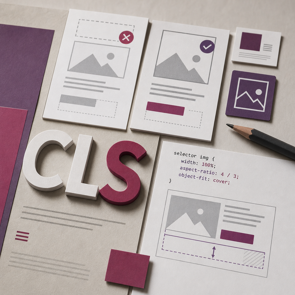
CLS (Cumulative Layout Shift) is a Core Web Vitals metric that measures how much page elements shift unexpectedly while a page is loading. When a heading suddenly moves down, a button shifts beneath the cursor, or cards change height after images appear, users are experiencing a layout stability problem.
In Elementor, these shifts are most often caused by images without reserved dimensions, web fonts, dynamic content, banners, popups, and scripts that change styles after the initial render. Below is a structured way to identify the source of CLS and fix it without masking the problem with arbitrary spacing.
What Is CLS and Why Does a Page Shift?
The browser initially builds a page based on the available HTML and CSS, then gradually adds images, fonts, widgets, and data loaded separately. If space was not reserved for a new element, the browser has to change the geometry of content that is already visible.
For example, an image in a product card may load without a defined height. Before it appears, the heading and button sit higher; after the image loads, all following content moves down. A similar effect occurs when a font changes the width of text lines and causes the content to wrap onto an additional line.
It is important to distinguish CLS from a normal animation. Expected movement, such as a menu opening smoothly after a user clicks, is not necessarily a CLS problem. The critical issue is unexpected movement that occurs without user interaction.
- Images, videos, and iframes do not have a reserved height.
- A dynamic block appears after data is received from a server or third-party service.
- A web font loads late and changes the width of text or the height of headings.
- JavaScript changes margins, dimensions, or the order of elements after loading.
- Advertising, cookie, or popup blocks are inserted into the document flow instead of being overlaid.
Start by Finding the Element Causing the Shift
Do not immediately add min-height to every section. First identify the exact element that changes the layout. Check the page in an incognito window or a clean browser session, because caching, the logged-in WordPress admin bar, and browser extensions can affect the result.
In PageSpeed Insights, review diagnostics related to layout shifts. In Chrome DevTools, open the Performance panel, record the page load, and analyze Layout Shift events. When you hover over one of these events, the browser highlights the elements that moved.
Test at least the mobile and desktop versions. On a narrow screen, a heading may wrap differently, an image may receive a different height, and hidden or mobile-specific blocks may load through a different process.
- Test the page after fully clearing the cache, not only after reopening it.
- Compare the experience for a new visitor and a logged-in user.
- Check whether the page shifts after a cookie banner, chat widget, or analytics script loads.
- Test the page separately with caching and optimization plugins disabled if they change the loading order of CSS or JavaScript.
Images: Reserve Space Before They Load
One of the most common causes of shifts in Elementor is an image whose proportions the browser cannot determine in advance. Upload files at the correct dimensions and use an appropriate size in the widget. A large photo reduced only with CSS increases the download size and does not solve the geometry problem.
For photos in cards, galleries, and previews, define the aspect ratio in advance. This is especially useful when all cards should have the same height. The object-fit property can fill the area without distorting the image, but account for the possibility that important details may be cropped.
If Elementor or the theme already outputs width and height attributes for an image, do not override them unnecessarily. Additional CSS is needed only when the actual layout requires a consistent aspect ratio.
- Use optimized WebP or AVIF images where your publishing workflow supports them.
- Do not upload images several times larger than the area in which they will be displayed.
- For the main image visible immediately, apply lazy loading carefully: overly aggressive deferred loading can harm the perceived experience of the first viewport.
- Give iframes, videos, and maps a container with a fixed or proportional aspect ratio.
selector img {
  display: block;
  width: 100%;
  aspect-ratio: 4 / 3;
  object-fit: cover;
}
Check Fonts, Headings, and Spacing
A font can cause CLS when the browser initially displays text in a system fallback font and then replaces it with a web font. Because the character widths differ, the number of lines in a heading, the height of the text block, and the position of the elements below it can all change.
Where possible, use a limited number of font styles and weights. Load only the variants actually used on the page. Hosting fonts locally can reduce dependence on a third-party domain, but it does not by itself guarantee that shifts will be eliminated.
Do not use JavaScript to change heading sizes, line-height, or margins after loading. Styles for different breakpoints should be defined in CSS or Elementor settings before the initial render.
- Check whether the fallback font matches the web font in width and proportions.
- Avoid using a large number of different font weights on one page.
- Set a predictable line-height for headings and body text.
- Do not rely on JavaScript to measure text and then adjust spacing.
Stabilize Dynamic Blocks in Elementor
Dynamic content may come from WooCommerce, ACF, an events plugin, a reviews widget, recommendations, or an external API. If a container is initially empty and text, images, or a list are inserted later, the section height changes after the page is already visible.
These blocks need an initial geometry defined in advance. This can be a min-height, a fixed aspect ratio, a skeleton placeholder, or a known component size. Choose the height based on the actual content and test it separately on mobile screens.
Do not use an excessively large min-height as a universal fix. Empty space left on the page harms the user experience and can be just as undesirable as a layout shift.
- Set a min-height for a block when its approximate height is known in advance.
- For grid cards, align the image and text areas so that one card does not push the entire row down.
- Display a placeholder with the same shape as the content that will appear.
- Do not insert important blocks above the main text without reserving space for them.
.dynamic-card {
  min-height: 320px;
}

.dynamic-media {
  aspect-ratio: 16 / 9;
  overflow: hidden;
}
Banners, Popups, and JavaScript: Common Hidden Causes
A cookie banner, advertising block, or promotional message should not suddenly be inserted into the normal document flow. If such an element appears at the top of the page after it has been built, it pushes all visible content downward. For persistent messages, reserve the area in advance; for overlay components, use positioning that does not push neighboring blocks.
Pay particular attention to Elementor Motion Effects, widget scripts, sticky elements, and third-party services. Animations should use transform or opacity rather than changing the height, width, margin, or position of elements in the flow without a clear need.
If the problem appears or disappears after JavaScript optimization, this is an important clue: deferred script execution may change when an element appears, but it does not always remove the underlying cause. Stabilize the layout first, then configure optimization.
- Do not add a top banner after loading without reserving an area for it in advance.
- Check chat, map, review, advertising, and social feed widgets.
- Prefer transform and opacity for animations.
- Apply deferred JavaScript execution carefully: it may hide the problem during one test but create it during another.
Final Verification After Making Fixes
After making changes, clear the WordPress cache, optimization plugin cache, CDN cache, and browser cache. If CSS is generated or combined, make sure the optimizer has created current files. Otherwise, you may be testing an outdated version of the styles.
Run the check again in PageSpeed Insights and Chrome DevTools Performance. Evaluate not only the final CLS score but also the list of shifted elements. A good result should remain stable across multiple loads, different screen widths, and slower network conditions.
Check the page manually: does a button move beneath the cursor, does the first viewport change height, does horizontal scrolling appear, or does a popup cover the main content? Then test templates that use the same widgets, because a fix in one Elementor block can affect other pages.
- Run separate tests for mobile and desktop versions.
- Compare the page before and after the changes in the Performance panel.
- Test slow loading of fonts, images, and third-party widgets.
- Do not evaluate CLS from one local run only: results can vary because of caching and network conditions.
Frequently asked questions
Can I fix CLS simply by adding min-height?
Sometimes min-height helps reserve space for a dynamic block, but it is not a universal solution. First find the element that shifts, then choose a height based on the actual content and set it separately for different screen sizes.
Can image lazy loading cause layout shifts?
Lazy loading itself does not necessarily cause CLS. The problem occurs when the image has no defined width, height, or aspect-ratio. The browser then does not know how much space to reserve before the file loads.
How can I tell whether fonts are causing CLS?
Watch for changes in line widths and heading heights after the web font appears. In the Performance panel, you can also compare the font loading time with the shift of text blocks.
Why does PageSpeed show CLS even though everything is stable in the Elementor editor?
The Elementor editor may load the page in a different way, with styles and resources already available. Check the published page as a new visitor, without the admin bar, cache, or editor overlays.
Conclusion
To fix CLS in Elementor, stabilize the page geometry before late-loading resources appear. Define dimensions or aspect ratios for media, reserve space for dynamic blocks, optimize fonts, and avoid changing the layout with scripts after the initial render.
After every fix, check not only the CLS number but also the specific element that shifts. This approach helps maintain predictable page behavior, makes interaction with buttons safer, and improves the overall experience of the site.