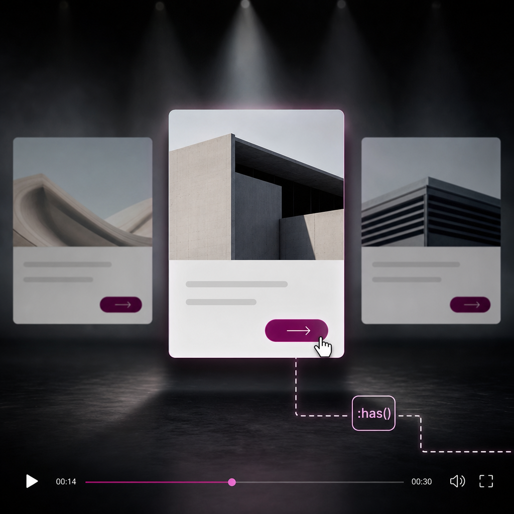
In standard CSS, it is easy to style a child element based on the state of its parent—for example, changing a button when a card is hovered. The reverse task—changing the card itself when the pointer is over its button—used to require JavaScript or additional classes.
The :has() pseudo-class solves this problem. It lets you select an element when it contains a child element that matches a specified condition. In Elementor, this is useful for service cards, product cards, post cards, and Loop Grid items.
What the :has() Pseudo-Class Does
The selector `.card:has(.elementor-button:hover)` means: select an element with the `card` class if it contains an Elementor button that is currently being hovered.
Unlike a standard descendant selector, :has() lets you style the parent container itself. This is useful when you want to highlight the entire card rather than only an individual button or link.
The pseudo-class works without JavaScript and does not change the page's HTML structure. The card state updates automatically along with the state of the child element.
- `:has(.elementor-button:hover)` — the card responds when the button is hovered.
- `:has(a:focus-visible)` — the card responds when a link receives keyboard focus.
- `:has(.sale-badge)` — you can change the card's appearance when it contains a sale badge.
- `:has(input:checked)` — you can style a block based on the state of a switch or checkbox.
How to Prepare a Card in Elementor
First, add a custom CSS class to the card container. Open the relevant container in Elementor and go to the Advanced tab. In the CSS Classes field, enter `card` without the period.
The class must be added to the parent container whose style you want to change. If you add it to the button, the :has() selector will not produce the desired effect.
Check the card structure: the button or link must be nested inside the container with the `card` class. If the button is actually outside the container because of the template structure, the selector will not work.
- Card container: the `card` class.
- Inside the container: a heading, description, image, and button or link.
- Add the class without the `.` symbol.
- Class names must match the CSS exactly, including hyphens and letter case.
Basic Example: Highlighting a Card When Its Button Is Hovered
First, define the card's default state. This is important because users should see a correct design even in a browser that does not support :has(). For a smooth transition, add transition to the properties that will change.
Then use :has() for the button hover and link focus states. This approach accounts for both mouse and keyboard interaction at the same time.
- Base styles work regardless of :has() support.
- Keep the transform moderate so the card does not shift neighboring elements.
- A shadow, border, or background change usually creates a clear visual signal.
.card {
  transition: box-shadow .25s ease, transform .25s ease;
}

.card:has(.elementor-button:hover),
.card:has(a:focus-visible) {
  transform: translateY(-4px);
  box-shadow: 0 12px 30px rgba(0, 0, 0, .12);
}
How to Add the CSS
You can place the code wherever custom styles are available in your configuration: your site, theme, or Elementor CSS settings. The key requirement is that the styles load on the page containing the card.
If you add CSS directly to a specific element, check whether that field supports complete CSS rules rather than only declarations for the current selector. If necessary, place the code in the site's global CSS.
Keyboard Support and Accessibility
Styling only with `:hover` does not cover users who navigate a page with a keyboard. That is why it is useful to add the `a:focus-visible` condition. When the link receives visible keyboard focus, the entire card changes.
Do not remove the default focus indicator without providing a replacement. Users need to understand which element is currently active. If the site's design uses a custom focus style, make sure it has sufficient contrast.
If the card contains a button rather than a link, you can account for both element types separately when needed.
- For links: `.card:has(a:focus-visible)`.
- For buttons: `.card:has(button:focus-visible)` or the Elementor button class selector.
- Do not rely only on a shadow change: focus should also be indicated with a border, outline, or another noticeable effect.
- Test the card state with the Tab key, not only with the pointer.
.card:has(a:focus-visible),
.card:has(button:focus-visible) {
  outline: 3px solid rgba(30, 100, 220, .45);
  outline-offset: 4px;
}
Practical Use Cases in Elementor
In service cards, :has() can connect a “Learn more” button with the entire block. In product cards, you can highlight the container when users interact with a purchase button or product link.
In a Loop Grid, the class must be present in the item template so that every generated card receives the same rules. If the class is assigned to the template container, the selector applies to each instance.
- Change the card background when an inner link is active.
- Add a product border when it contains a sale badge.
- Show an additional icon or change the heading color when the button receives focus.
- Style a form block when a checkbox inside it is selected.
- Highlight a menu's parent element when one of its items receives focus.
.card:has(.sale-badge) {
  border-color: #e53935;
}

.card:has(.elementor-button:hover) .card-title,
.card:has(a:focus-visible) .card-title {
  color: #1e64dc;
}
Compatibility, Fallbacks, and Common Mistakes
:has() is supported by modern browsers, but the rule may be ignored in older versions or certain outdated environments. Therefore, define the card's basic appearance without :has() and use the pseudo-class effect as a progressive enhancement.
If a browser does not recognize the :has() selector, the rule group containing it will not be applied. However, the base `.card` properties will remain active if they are defined in a separate rule.
Avoid unnecessarily complex selectors. They make styles harder to maintain and may lose to Elementor or theme rules with greater specificity.
- Do not write `.card:has(.elementor-button:hover)` on the button—the `card` class must be on the parent container.
- Do not add a period in Elementor's CSS Classes field: enter `card`, not `.card`.
- Make sure the button is actually inside the card in the DOM structure.
- Clear the plugin, CDN, and browser caches after changing the CSS.
- Check whether an Elementor or theme rule is overriding the style.
- Do not use `overflow: hidden` if the raised card or its shadow needs to extend beyond the container.
.card {
  transform: none;
  box-shadow: 0 2px 10px rgba(0, 0, 0, .06);
  transition: box-shadow .25s ease, transform .25s ease;
}

@supports selector(.card:has(a)) {
  .card:has(.elementor-button:hover),
  .card:has(a:focus-visible) {
    transform: translateY(-4px);
    box-shadow: 0 12px 30px rgba(0, 0, 0, .12);
  }
}
How to Check Why the Style Is Not Working
Open your browser's developer tools and select the card container. Make sure it has the `card` class and that the button or link is nested inside that same element.
Then check the rule in the Styles panel. If it is crossed out, the issue is usually specificity or the order in which the CSS is loaded. If the rule does not appear at all, check the selector syntax and where the code was inserted.
- Check the class on the correct container.
- Check that the button or link is nested inside it.
- Check the `:hover` and `:focus-visible` states in DevTools.
- Temporarily add a noticeable `background` to quickly see whether the selector is working.
How to Test the Finished Effect
After adding the styles, test the card on the live page rather than only in the Elementor editor. Hover over the button, move the pointer outside the card, and make sure the state returns to its default appearance.
Test keyboard navigation separately. Press Tab, observe the visible focus, and check whether the correct card is highlighted. Also view the page at a narrow width: the effect should not create horizontal scrolling or overlap neighboring blocks.
- Hover over the button with the mouse.
- Focus the link or button with the Tab key.
- Check several cards at the same time.
- Test mobile and tablet widths.
- Test in several modern browsers.
- Test again after clearing the cache.
Frequently asked questions
Do you need JavaScript to style a parent container?
No. The :has() pseudo-class lets you change a parent container's style with CSS alone when a child element matches a specified condition.
Where should you add the card class in Elementor?
Add the `card` class to the card's parent container in the Advanced tab, in the CSS Classes field. Enter `card` without the period.
Will :has() work in a Loop Grid?
Yes, if the class is added to the item template's container and the required button or link is inside that container. Check the final HTML structure with developer tools.
What happens in a browser that does not support :has()?
Rules containing :has() will not be applied, but the card's base styles will remain if they are defined separately. For this reason, the card's correct appearance should not depend entirely on this pseudo-class.
Why does the card not respond when the button is hovered?
The most common causes are that the class was added to the wrong container, the button is not nested inside the card, the CSS is being overridden by another rule, or cached changes are being hidden. Check the DOM structure, Styles panel, and site cache.
Conclusion
The :has() pseudo-class gives Elementor developers a simple way to connect a child element's state with the styling of an entire card. All you need to do is add a custom class to the container and define the required condition in CSS.
The best practical approach is to combine base styles without :has(), responses to `:hover` and `:focus-visible`, and testing of keyboard navigation and mobile layouts. This keeps cards clear, accessible, and predictable across different environments.