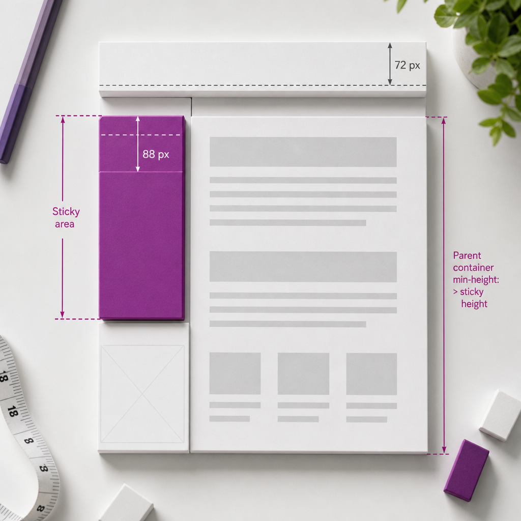
A sticky element in Elementor keeps a sidebar, CTA block, menu, or other important component visible while users scroll down the page. Unlike fixed positioning, a sticky block initially occupies its normal place in the layout and then attaches to a defined boundary during scrolling.
However, sticky does not work in isolation. Its behavior is affected by the height of the parent container, Flexbox settings, overflow, a fixed header, mobile navigation, and other theme or plugin styles. Below, we will look at how to configure the effect without covering content or causing unexpected stops.
When You Really Need a Sticky Element
Sticky elements are most often used for a sidebar with a table of contents or filters, a call-to-action block, a contact card, a short form, in-page navigation on a long page, or a panel with useful links. Their purpose is to keep an important action accessible while the user views the relevant section.
Not every block that needs attention should be made sticky. Too many elements moving with the page make the interface harder to follow and can cover text on small screens. Be especially careful with floating CTAs, chat widgets, cookie notices, and mobile menus.
- For a sidebar, sticky is usually appropriate only on tablet and desktop devices.
- For long articles, you can fix a table of contents or a small navigation block.
- For a short page, the effect may be barely noticeable or unnecessary.
- On mobile devices, sticky is often best disabled if it takes up a significant part of the viewport.
How to Enable Sticky in Elementor
Open the required widget or container in Elementor and go to the Advanced section. In Motion Effects, find the Sticky setting and choose a direction, usually Top. Elementor also lets you define separately which devices should use the effect.
After enabling sticky, check the Top Offset field. It determines the distance between the top edge of the viewport and the sticky element. A value of 0 may be appropriate only when the page does not have a fixed header. Otherwise, the block may move underneath the site header.
If the fixed header is 72 px high, you can start with a Top Offset of about 88 px. This is not a universal value: test it on the actual page because the header height may change after scrolling or at different breakpoints.
- Choose Sticky only for the devices that need it instead of automatically enabling it everywhere.
- Check the offset while the page is scrolled, not only at the top.
- If the header has different heights on desktop and mobile, use different values or disable sticky on mobile.
- After changing the settings, clear the site and browser caches if the result has not updated.
How to Choose the Right Top Offset
Measure the actual height of the header in its normal and scrolled states. Add a small amount of space so that text or a button does not touch the bottom edge of the header. If the header changes height after scrolling, use the state in which it remains for most of the time as your reference.
Do not use a large offset without a reason. The sticky block will stop lower on the page, reducing the usable screen area. For the mobile version, also account for the browser interface and any open navigation.
Parent Container Requirements
A sticky element can move only within the boundaries of its parent container. When the container ends, the element stops sticking and leaves the sticky state. Therefore, the parent container must be taller than the block itself and contain enough content to allow scrolling.
A common example is a two-column layout: long text on the left and a CTA or sidebar on the right. If the right column is only as tall as the CTA, while the row or container is configured incorrectly, the effect may not appear or may end immediately.
Do not place a sticky block in a section or container with a fixed or excessively small height. Also check whether the parent element clips its content through the overflow setting.
- The parent container must be taller than the sticky element.
- Do not give the parent element a height that artificially limits its content.
- Check the Overflow settings in the section, container, and column.
- Avoid overflow: hidden or similar restrictions on sticky ancestors if they interfere with scrolling.
- Make sure there is no unexpected empty space between the sticky block and the bottom edge of the container.
Configuring Flexbox Containers
In Flexbox layouts, sticky may fail because of child-element alignment. If elements are stretched to fill the row height, the sticky block may effectively occupy all available height and have no room to move.
For a sticky child element, Align Self: Flex-start often helps. This cancels stretching for the specific element and allows it to retain its own height. Apply this setting to the sticky block itself rather than changing the entire container without checking the layout.
- Select the sticky widget or inner container.
- In the Layout settings, find Align Self and set it to Flex-start if the element is being stretched.
- Check whether the Stretch setting in the parent Flexbox container is changing the element's height.
- Compare the result in the editor with the published page.
What to Check in a Two-Column Layout
The long column containing the main content should create the actual height of the row. The shorter column with the sticky block should not be stretched so that its inner element becomes as tall as the entire section.
If the sticky element is inside several nested containers, check every level: height, overflow, alignment, and positioning. The problem often occurs not in the widget itself but in one of its ancestors.
Why Sticky Overlaps the Header or Other Content
The most common reason is that the Top Offset is smaller than the height of the fixed header. In this case, the browser is correctly applying sticky logic, but the block attaches to the top edge underneath the header. Increase the offset and check the page while scrolling.
Another reason is a layer conflict. If the header or mobile menu has a high z-index, the sticky block may appear underneath it. If the sticky element has an excessively high z-index, it may cover menus, modal windows, or cookie notices. Do not increase z-index without checking all layers.
Also make sure the sticky block does not have a large background area that covers nearby text. Sometimes the issue is not positioning but the fact that the container has received a background, minimum height, or internal spacing that was not present in the original layout.
- Compare the Top Offset with the actual height of the header.
- Check the z-index values of the header, sticky block, mobile menu, and pop-up windows.
- Do not use sticky for elements that are meant to cover the entire screen.
- Check the top and bottom margins, padding, and minimum heights of containers.
Adapting Sticky for Mobile Devices
An element that looks convenient on a wide screen may take up a significant part of the mobile viewport. This is especially critical for a CTA with a lot of text, a form, a sidebar, or a block that sticks beneath a fixed mobile header.
In Motion Effects, choose the devices on which sticky should work. For the mobile breakpoint, you can disable it completely or keep it only for a small, compact element. Do not evaluate the result only in Elementor's responsive preview: a real browser may handle viewport height, the address bar, and open navigation differently.
- Test scrolling on an actual smartphone, not only in an emulator.
- Open and close the mobile menu: the sticky element should not remain above the navigation.
- Check the page in both portrait and landscape orientations.
- Make sure sticky does not cover a Next button, form fields, or the bottom part of the content.
- If the block interferes with reading, disable sticky on mobile. This is often better UX than creating complex exceptions.
Step-by-Step Testing and Common Errors
After configuring the effect, do not limit testing to a short scroll near the top of the page. Scroll to the middle and bottom, check when sticky starts, where it stops near the end of the container, and how it behaves after the page is refreshed.
If the effect does not work, temporarily disable custom styles, CSS optimization, and third-party scripts. This will help determine whether the issue is related to Elementor, the theme, a caching plugin, or custom CSS rules.
- Sticky is not enabled for the device being tested: check the responsive settings.
- The parent container is too short: increase the actual height of the content.
- One of the ancestors has an overflow setting that restricts sticky behavior.
- Flexbox is stretching the child element: try Align Self: Flex-start.
- The Top Offset does not account for the header or the WordPress admin bar shown to logged-in users.
- Another element overlaps the sticky block because of z-index or a stacking context.
- The cache is serving old styles: clear the Elementor, optimization plugin, and browser caches.
- Sticky was left enabled on mobile without testing the open menu.
Quick Pre-Publication Checklist
Check that the entire sticky block remains visible after it attaches, that its heading is not hidden under the header, and that it does not cover nearby content. Then test the bottom boundary of the parent container: the block should stop naturally rather than disappear or remain over the next section.
Also test the logged-in WordPress state if administrators edit the page. The top admin bar can change the available space and create the impression that the offset is incorrect.
- Desktop: sticky starts and stops within the intended container.
- Tablet: the content is not critically compressed, and the block does not cover the text.
- Mobile: sticky is disabled or does not interfere with navigation and reading.
- After clearing the cache, the behavior remains consistent.
Frequently asked questions
Why is Sticky not working in Elementor?
Check whether the effect is enabled for the current device, whether the parent container is tall enough, and whether any ancestor has a restrictive overflow setting. In a Flexbox layout, also check Align Self: Flex-start.
What Top Offset should I use for a sticky block?
The value should be no smaller than the actual height of the fixed header. For example, for a 72 px header, test 88 px with a small margin and then adjust it for the specific layout.
Can I keep sticky enabled on mobile?
Yes, if the block is compact and does not cover content, the menu, or form elements. For a large sidebar or CTA, it is usually better to disable sticky on mobile.
Why does sticky stop earlier than expected?
Sticky works within the boundaries of its parent container. If the container ends, is not tall enough, or restricts content through overflow, the element will stop moving earlier.
Do I need custom CSS for Sticky in Elementor?
In most cases, the standard Motion Effects settings are sufficient. Custom CSS may be needed for complex layer conflicts or specific responsive adjustments, but first check the container, Flexbox, offset, overflow, and z-index.
Conclusion
A reliable sticky element depends on more than simply enabling the Sticky setting. You need to account for the Top Offset, header height, parent container structure, Flexbox alignment, and possible overflow restrictions.
Before publishing, test the effect at all required breakpoints and on an actual smartphone. If sticky starts covering content or mobile navigation, disabling it on small screens is a better solution than trying to preserve the effect at any cost.