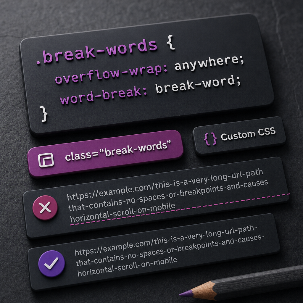
A long URL, email address, hashtag, or technical string without spaces can stretch an Elementor text widget or the entire container beyond the edge of the screen. On smartphones, this appears as horizontal scrolling: users have to move the page sideways, and the layout loses its clean appearance.
You can solve the problem without hiding content or changing the HTML. Simply allow the browser to wrap long strings by adding a CSS class to the required widget or container. Below is a safe approach for URLs, email addresses, codes, and similar text.
Why Long Strings Break Responsive Layouts
Browsers usually wrap text at spaces or hyphens. A URL such as https://example.com/catalog/product/category-123456789 or an email address may not contain a convenient break point. If the string is longer than the width of its parent element, it starts extending beyond the container.
In Elementor, this may be noticeable not only in a text widget. A long string can increase the width of a column, cause a section to overflow, or create horizontal scrolling for the entire page. The problem most often appears on mobile screens approximately 320–375 px wide.
The cause can also be related to flex or grid container properties. Even when text is allowed to wrap, a child element may sometimes refuse to shrink because of the default min-width: auto. In that case, you also need to allow the element to become narrower.
- URLs without spaces or hyphens
- Long email addresses
- Identifiers, hashes, and order numbers
- Code strings or technical parameters
- Long file names
The Basic Solution: Use the break-words CSS Class
Add the break-words class to a text widget or container, then apply wrapping rules to it. Assign the class only to the element where long strings may appear rather than to the entire page.
The overflow-wrap: anywhere property allows the browser to break a string at any point when it would otherwise extend beyond the available width. Regular text containing spaces will continue to wrap naturally.
The word-break: break-word property can help with compatibility and further instructs the browser not to leave a long string outside the container. Do not use word-break: break-all as a universal solution: it can break ordinary words even when this is unnecessary.
- Open the settings for the required text widget or container.
- In the field for additional CSS classes, enter break-words without a period at the beginning.
- Add the CSS in Elementor Custom CSS or in the site's general additional styles.
- Save the changes and check the page at a mobile width.
.break-words {
  overflow-wrap: anywhere;
  word-break: break-word;
}
How to Add the Style in Elementor
If Custom CSS is available in your Elementor configuration, you can add the rule directly to the required element or to the global styles. Panel names and locations may vary depending on the editor, theme, and active add-ons, so look for the custom CSS field in the element or site settings.
For targeted use, enter the break-words class in the CSS Classes field and use the .break-words selector in the CSS. The period is required in the CSS selector, but not when entering the class name in the element settings.
If your version or plan does not include a Custom CSS field, you can add the same code through WordPress general additional styles, the theme settings, or a separate stylesheet in a child theme. Make sure the CSS loads on the page containing the affected element.
- Class in Elementor settings: break-words
- Selector in CSS: .break-words
- Do not add a period to the class name in the CSS Classes field
- After making changes, clear the plugin, CDN, or browser cache if the old styling is still displayed
What to Do If the Container Still Extends Beyond the Screen
Sometimes the issue is not caused by text wrapping alone. For example, a long string may be inside a flex container while the child element is not allowed to shrink. In this case, you can add min-width: 0 and max-width: 100% to the class.
These properties do not replace overflow-wrap; they complement it. min-width: 0 is especially useful for elements inside flex or grid layouts, while max-width: 100% prevents an element from becoming wider than its parent container.
- Check whether the widget has a fixed width.
- Make sure the parent container does not have excessive horizontal padding or negative margins.
- For a flex or grid child element, try adding min-width: 0.
- Check whether white-space: nowrap has been applied.
- Do not use overflow-x: hidden as the primary fix: it may simply hide part of the URL or other content.
.break-words {
  min-width: 0;
  max-width: 100%;
  overflow-wrap: anywhere;
  word-break: break-word;
}
Special Case: Code and pre Blocks
Code snippets are often rendered in a pre element, which may have white-space: pre set by default. As a result, normal wrapping does not work in the same way as it does in a text widget. If the code needs to remain readable on mobile devices, it requires a separate rule.
Not every technical string should be wrapped. In some cases, users may find it more convenient to scroll through a code block horizontally to preserve its formatting. For URLs, tokens, and short identifiers, wrapping is usually preferable, but important values should also be provided in a format that is easy to copy.
- Use break-words for a regular URL or email address.
- For a pre block, add white-space: pre-wrap when needed.
- Do not apply aggressive wrapping to tables, code, or JSON without checking readability.
- Make sure wrapping does not change the meaning of the value when the line is copied.
.break-words pre {
  white-space: pre-wrap;
  overflow-wrap: anywhere;
  word-break: break-word;
}
How to Check the Result on Mobile Devices
After adding the style, check not only the Elementor editor but also the published page. The editor may use different spacing, panels, or scaling, so it does not always accurately represent the behavior of a real mobile screen.
Switch to mobile mode in your browser or open the page on a smartphone. Test the longest URL, the longest email address, and any other strings that are actually used on the site.
- Check widths of approximately 320, 360, and 375 px.
- Scroll the page sideways: there should be no horizontal movement.
- Make sure the text has not been cut off and that links remain clickable.
- Review the page after clearing the cache.
- Check multiple templates if the class is used globally.
Frequently asked questions
Do I need to add break-words to every container?
No. Add the class only to elements where long URLs, email addresses, code, or other strings without spaces may appear. Applying the style to the entire page is usually unnecessary.
Why is word-break: break-all undesirable?
It can break ordinary words between any characters, making the text less readable. For long URLs and technical strings without spaces, it is safer to start with overflow-wrap: anywhere.
Can I simply add overflow-x: hidden to the body?
This only hides content extending beyond the screen; it does not fix the underlying cause. Part of a URL or other content may remain inaccessible, so fix the wrapping and element width first.
What should I do if the CSS is not applied?
Check the class name, the period in the selector, the specificity of other rules, and the cache. Also make sure the style was added in a location that loads on the required page.
Conclusion
For most cases involving long URLs, email addresses, and technical strings, it is enough to add the break-words class with the overflow-wrap: anywhere rule. This preserves the content, avoids hiding overflow, and prevents horizontal scrolling on mobile devices.
If the problem remains, check min-width, fixed widths, white-space: nowrap, and the flex container settings. Always test the final result on real narrow screens rather than only in Elementor's editing mode.