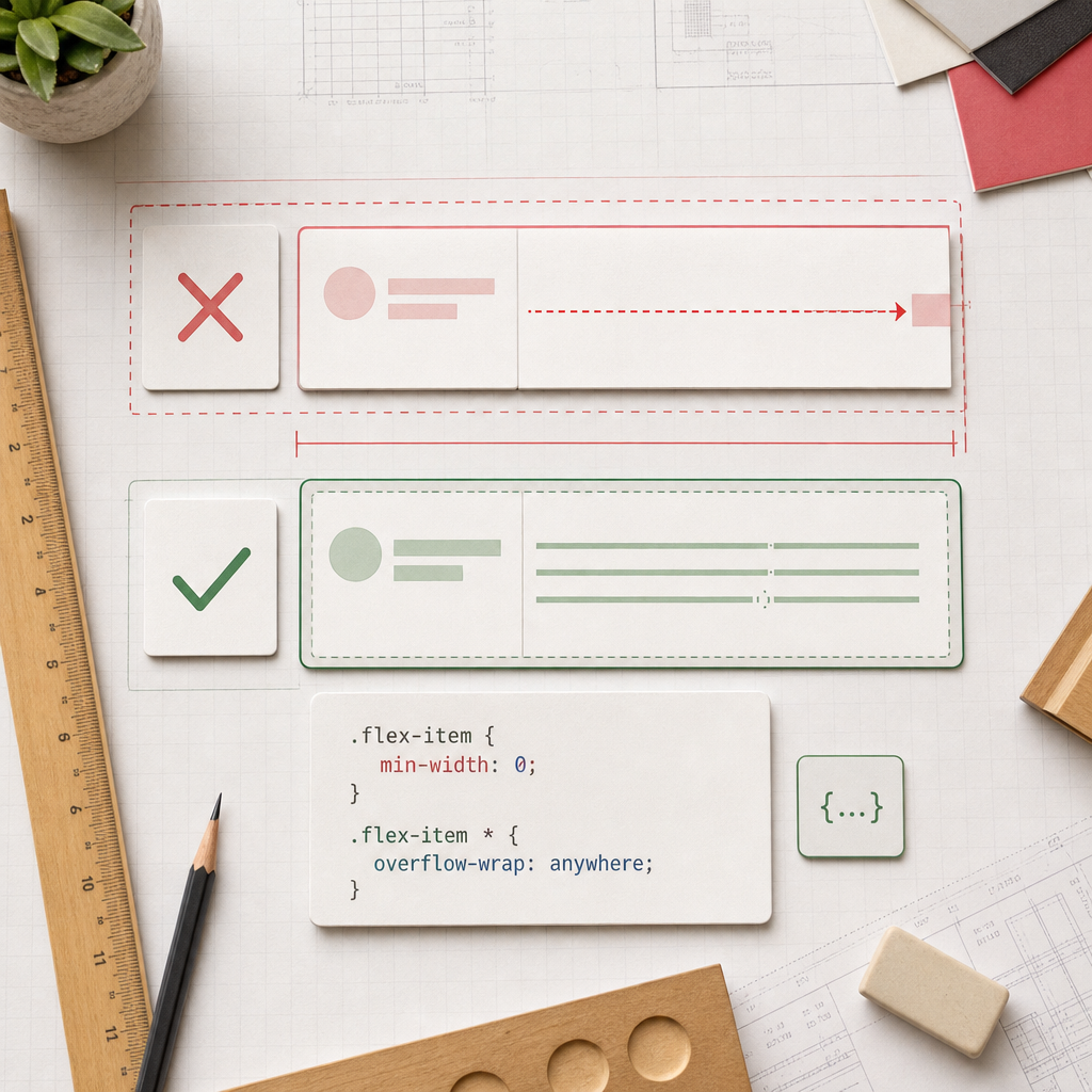
Horizontal scrolling on the mobile version of an Elementor page is often caused not by the container itself, but by one of its child elements. A long heading, URL, product code, email address, or unbroken word can force a flex item to remain wider than the available space.
As a result, the page extends beyond the viewport and users see a horizontal scrollbar. In Flexbox, this is usually related to the default min-width: auto value, which prevents an element from shrinking below the minimum width of its content. The solution is to allow the item to shrink correctly and add text wrapping for long strings.
Why a Flexbox Container Causes Overflow
By default, Flexbox tries to keep a child element's content visible. For a flex item, the minimum width is often determined by its content: a long word, link, image, table, or element with white-space: nowrap.
For example, a container may be 360 px wide on a smartphone, while a heading or URL inside it effectively requires 500 px. The parent container cannot always force that element to shrink, so the page becomes wider than the screen.
The issue is especially noticeable in Elementor's hierarchy of nested containers. Even when the outer container is configured correctly, overflow may originate from an inner container or widget.
- Long URLs and email addresses without spaces;
- Headings or technical names containing long words;
- Images or videos without a maximum-width limit;
- Tables, code, and pre blocks;
- The CSS property white-space: nowrap;
- A fixed width or minimum width on an inner element.
The Basic Fix: min-width: 0
The min-width: 0 property allows a flex item to shrink to the width defined by its parent container, even when its content is wider. It does not cut off the content or hide the overflow; it changes the minimum-width rule applied to the flex item itself.
For convenience, you can assign the class flex-item to the child container or problematic element in Elementor. The class name is not mandatory; what matters is that it matches in the element settings and the CSS.
- Select the child container or another flex element that is causing the overflow.
- Add the class flex-item in the CSS Classes field, without the dot.
- Add the CSS in Elementor Custom CSS, if this feature is available in your configuration, or in the theme CSS or WordPress additional styles section.
- Clear the site and browser cache if the changes are not visible immediately.
.flex-item {
  min-width: 0;
}
How to Wrap Long URLs and Words
min-width: 0 is not always enough. It allows the container to shrink, but a long string inside it may still extend beyond its boundaries. In these cases, you also need to enable line wrapping.
The overflow-wrap: anywhere property allows the browser to break long words, URLs, and technical strings at any point. This is a practical solution for mobile screens, where keeping all text accessible without horizontal scrolling is important.
- Apply the rule to the specific problematic container when you want to preserve standard wrapping elsewhere on the page.
- For URLs, email addresses, and technical strings, anywhere is generally more reliable than wrapping only at spaces.
- Check long words in headings, buttons, badges, and breadcrumbs.
.flex-item {
  min-width: 0;
}

.flex-item * {
  overflow-wrap: anywhere;
}
When Not to Apply the Rule to All Child Elements
The .flex-item * selector targets every element inside the container. This is convenient as a quick solution, but it may change text wrapping in buttons, navigation, or specialized components. If the issue is limited to one area, use a more precise class instead.
- For text: .flex-item .elementor-heading-title, .flex-item p;
- For links: .flex-item a;
- For a specific widget: add a custom class to it and style only that class.
.flex-item a,
.flex-item .elementor-heading-title {
  overflow-wrap: anywhere;
}
How to Find the Element Extending Beyond the Screen
It is not always obvious which block is creating the horizontal scrollbar. Check the page in Elementor's mobile view, then open it in a browser at a narrow width. Temporarily disable or hide suspicious widgets to identify the source of the problem.
In the browser DevTools, select the suspected element and check its actual width, min-width, width, flex-basis, white-space, and overflow values. If the child element is wider than its parent container, inspect its own styles and the styles of its nested elements.
Look for horizontal overflow caused not only by text, but also by images, icons, tables, and third-party widgets. In some cases, the scrollbar is created by an element with a negative margin or absolute positioning, so min-width: 0 will not be the primary solution.
- Check every level of nested Flexbox containers;
- Compare the element's width with the width of its parent container;
- Look for fixed width and min-width values in mobile settings;
- Check for nowrap, a wide table, or an oversized image;
- Test the page at a narrow width after every change.
What to Check in Elementor's Responsive Settings
CSS can correct the shrinking behavior, but it does not replace responsive layout configuration. If a fixed width is assigned to a container or widget, check it separately for mobile view. Also review the inner padding, spacing between elements, and the Flexbox direction.
For a horizontal row on a smartphone, it may be more appropriate to let the elements switch to a column or use a smaller gap. If the row must remain horizontal, make sure every child element can shrink and does not have an unnecessary minimum width.
Images should generally remain within the container. They often need the max-width: 100%; height: auto; rule, but it should be applied according to the specific widget and Elementor's styles.
- Check the width and min-width at the mobile breakpoint;
- Review the padding and gap of the containers;
- Check the Flex Direction and Wrap settings;
- Make sure buttons and menus do not use forced nowrap unnecessarily;
- Test the page separately in smartphone landscape orientation.
Why overflow-x: hidden Is Not the Best Primary Solution
The overflow-x: hidden property hides content that extends beyond the page boundaries. The horizontal scrollbar may disappear visually, but the underlying cause remains: text, a button, or another important element may be cut off and unavailable to the user.
This rule can sometimes be appropriate for controlled decorative effects, such as an animation intentionally extending beyond a section. However, for long text or an error in the Flexbox structure, first fix the width, min-width, text wrapping, and responsive styles.
- Do not use hidden as a substitute for finding the problematic element;
- Do not hide overflow on the body or the entire page without checking the content;
- After making the fix, check that keyboard focus, menus, and interactive elements are not being clipped.
Final Checks After Making Changes
After adding the CSS, check the page in Elementor's mobile view and directly in a browser. It is important to test not only the main page, but also templates that use the same classes, including the header, footer, post cards, product pages, and forms.
Make sure long text wraps, images stay within the container, and horizontal scrolling does not appear after fonts load, a menu opens, or the device orientation changes.
- Check several screen widths rather than just one;
- Test long URLs, headings, and email addresses;
- Check the page after clearing the cache;
- Make sure the CSS class is assigned to the correct child element;
- If the issue remains, look for a fixed width, absolute positioning, or a wide third-party widget.
Frequently asked questions
Is adding only min-width: 0 enough?
Not always. The property allows the flex item to shrink, but a long URL or word may still overflow its inner content. In that case, add overflow-wrap: anywhere to the relevant text or container.
Where should CSS be added for Elementor?
You can add CSS in Elementor Custom CSS if this feature is available in your configuration, or in WordPress additional styles or the theme's CSS file. Make sure the flex-item class is assigned to the correct element and that other styles do not override it.
Can min-width: 0 be applied to all containers?
Technically, yes, but it is safer to start with the container that is causing the overflow. Applying it broadly may change the behavior of a complex layout, so check all responsive states afterward.
Why is the horizontal scrollbar still present after adding the CSS?
The cause may be an image, table, negative margin, absolute positioning, fixed width, or third-party widget rather than a flex item. Check the actual width of the elements in DevTools and identify the one extending beyond the viewport.
Conclusion
For horizontal scrolling in Elementor Flexbox containers, start by finding the specific child element that is wider than the available space. Adding min-width: 0 allows it to shrink correctly, while overflow-wrap: anywhere prevents overflow caused by long URLs and words.
Do not mask the problem with a global overflow-x: hidden rule until you have checked widths, nested containers, and responsive settings. A targeted CSS fix keeps the content accessible and makes the mobile layout more predictable.