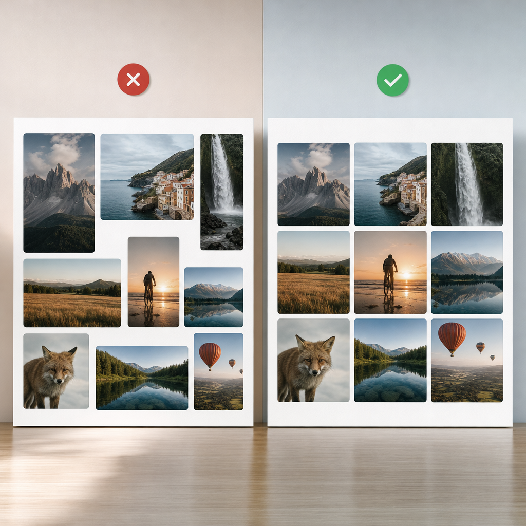
When Elementor cards contain photos with different proportions, the blocks may have inconsistent heights. As a result, headings and buttons shift, the grid looks untidy, and the page may visibly jump while loading.
The CSS aspect-ratio property lets you define an image’s width-to-height ratio in advance. Combined with object-fit, it helps create a predictable grid without distorting photographs.
Why Images Cause Layout Shifts
Browsers build pages progressively. If an image’s dimensions have not yet been determined, or if different files use different aspect ratios, the block height may change as each photo loads. The text below moves, and users see an unstable interface.
The problem is especially noticeable in catalogs, blogs, portfolios, and product cards where images are arranged in multiple columns. Even when all cards have the same width, the height of the photos may differ.
aspect-ratio reserves a proportional area before the image has fully loaded. This helps the browser understand the element’s future height, so cards in the same row remain visually consistent.
- 4 / 3 — a versatile format for cards and article previews.
- 16 / 9 — a wide format for banners, videos, and cover images.
- 3 / 4 — a vertical format for portraits, clothing, or editorial cards.
- 1 / 1 — a square format for catalogs and galleries.
How to Add aspect-ratio to an Image in Elementor
First, add a class to the container or another parent element that contains the image. For example, use the class card-image. The class name can be anything, but it should not contain spaces or special characters.
Next, add the CSS in Elementor Custom CSS, if this option is available in your configuration, or in the site’s additional global styles. The main selector should target the image inside the container.
- Make sure the class is applied to the correct container, not to the entire card.
- Check that the container contains an actual HTML img element.
- If the page includes several types of images, use separate classes for each format.
.card-image img {
  width: 100%;
  aspect-ratio: 4 / 3;
  object-fit: cover;
  display: block;
}
If CSS Is Added Directly to an Elementor Element
In some Custom CSS configurations, styles are written in the context of the current element. In that case, you may use Elementor’s special selector instead of the class name. The exact syntax depends on where the CSS is added, so check the result in the preview.
- For CSS added to a parent element, you may need a selector such as selector img.
- For global styles, use a custom class, such as .card-image img.
- Do not add a period before the class name in Elementor’s CSS Class field; the period is required in the CSS selector itself.
selector img {
  width: 100%;
  aspect-ratio: 4 / 3;
  object-fit: cover;
  display: block;
}
How object-fit: cover and contain Work
aspect-ratio defines the shape of the area, but it does not determine how the photograph should fit inside it. That is handled by object-fit.
The cover value fills the entire area. If the file’s proportions do not match the container’s proportions, part of the image will be cropped at the edges. The photograph is not stretched or distorted.
- cover is suitable for cards where consistent dimensions and a tidy grid are important.
- contain displays the entire image but may leave empty space around it.
- fill can distort the photograph, so it is best avoided for content images.
- If a face or another important subject is cropped, adjust the framing with object-position.
.card-image img {
  width: 100%;
  aspect-ratio: 4 / 3;
  object-fit: cover;
  object-position: center;
  display: block;
}

.card-image.contain img {
  object-fit: contain;
  background-color: #f3f3f3;
}
How to Choose the Right Proportions for Different Blocks
Choose an aspect ratio based not only on appearance but also on the content of the photographs. If images are frequently cropped, changing the aspect-ratio or the image position is usually a better solution than trying to correct the issue with margins or padding.
For blog cards, 4 / 3 is often a convenient starting point because it balances wide and vertical formats. For banners and cover images at the top of a page, 16 / 9 is usually more logical. For portraits or vertically shaped products, use 3 / 4.
- Do not mix different aspect ratios in the same row if the cards need to have equal heights.
- Test several typical photographs in advance rather than relying on a single sample image.
- For the mobile version, you can keep the same proportions or change them separately if the narrow screen changes the composition.
- If a frame is difficult to adapt to cropping, use contain or prepare separate images for the cards.
@media (max-width: 767px) {
  .card-image img {
    aspect-ratio: 1 / 1;
  }
}
What to Check After Adding the CSS
After saving the styles, check not only the Elementor editor but also the live page in a browser. The editor may display additional wrappers or styles that affect the result.
View the page on both wide and narrow screens. Images should remain proportional, and cards should not change height after loading. Also test long headings, different amounts of text, and photographs with vertical compositions.
- Clear the site, optimization plugin, and browser caches if the changes are not visible.
- Check whether a rule with higher specificity is overriding your style.
- In DevTools, make sure the class is applied to the correct element and that the CSS rule has not been crossed out.
- Check whether a fixed height has been set that conflicts with aspect-ratio.
- Make sure the image does not have unnecessary padding or a border that changes the expected dimensions.
Common Mistakes and Limitations
aspect-ratio does not fix poorly prepared images and does not replace responsive optimization. If the file is very large, the page may still load slowly. Use an appropriate image size, a modern format when supported by the site, and correct width and height attributes.
It is also important to distinguish between the container class and the class applied to the image itself. If the selector is written as .card-image img but the class is assigned to a different wrapper level, the rule may not work or may affect the wrong block.
Do not apply conflicting rules such as height: auto, a fixed height, and height: 100% at the same time without understanding the container structure. The parent element’s height, overflow, and widget styles can change the result.
- Do not use cover if cropping is critical to the meaning of the photograph.
- Do not rely only on the visual result in a single browser.
- Do not apply aspect-ratio to the entire card if only the image area needs to be constrained.
- Do not overlook accessibility: the image’s alt text should remain meaningful.
Frequently asked questions
Do I need to set aspect-ratio for each image separately?
No. If several images serve the same design role, add a shared class to the container and apply one CSS rule to all img elements inside it.
Why is the photograph cropped after I set cover?
cover fills the entire area using the specified proportions, so part of the image may extend beyond its boundaries. If you need to display the entire photograph, use object-fit: contain or change the aspect-ratio.
Can I use aspect-ratio without Elementor Pro?
Yes. The aspect-ratio property is standard CSS. You can add it through the additional styles field available in your theme, a child theme, or another safe method of adding CSS.
Will aspect-ratio eliminate all page shifts?
It helps reserve space for an image, but it does not eliminate every possible layout shift. Fonts, advertising blocks, dynamic content, lazy loading, and parent-container styles can also affect the layout.
Conclusion
To create a stable Elementor grid, define a class for the image container, set aspect-ratio, apply width: 100%, and choose the appropriate object-fit value. For cards, the 4 / 3 and cover combination is often a good choice.
Before publishing, test several different photographs, the mobile layout, the cropping of important details, and any conflicts with fixed heights. This will give you a predictable layout, cleaner cards, and fewer visual shifts during loading.