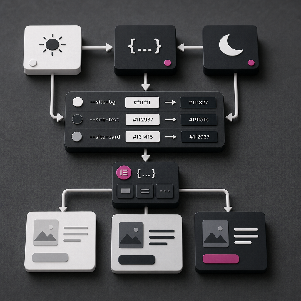
A dark theme does not necessarily require duplicating every style in Elementor. Instead of assigning separate colors to every container, you can define core values as CSS variables and change them according to the user's operating system settings.
This approach makes design maintenance easier: you only need to update a few variables to change the background, text, cards, borders, and accent elements across the entire site. Below, we will examine how to organize a dark theme, connect variables to Elementor, and check the result without common mistakes.
How Dark Mode Works with CSS Variables
A CSS variable is a named value that can be reused in different rules. Variables are usually declared in :root, making them available to all page elements. For example, instead of using dozens of #ffffff values in your styles, you can use a variable such as --site-bg.
The prefers-color-scheme: dark media query detects whether dark mode is enabled in the user's operating system or browser. If it is, the browser automatically applies the dark variable values. Visitors do not need any additional buttons or switches.
- The light theme is defined as the default option.
- Dark values override the defaults in @media (prefers-color-scheme: dark).
- Elementor components use the same variables instead of separate color values.
- The color palette can be changed centrally in one location.
:root {
  --site-bg: #ffffff;
  --site-text: #1f2937;
  --site-card: #f3f4f6;
  --site-border: #d1d5db;
  --site-accent: #2563eb;
}

@media (prefers-color-scheme: dark) {
  :root {
    --site-bg: #111827;
    --site-text: #f9fafb;
    --site-card: #1f2937;
    --site-border: #4b5563;
    --site-accent: #93c5fd;
  }
}
Where to Place the CSS Code
Global variables should be stored somewhere they will be available across the entire site: in the theme's Custom CSS, the child theme's stylesheet, or another trusted location for global CSS. If you use Elementor Pro, global styles and Custom CSS can also be part of Elementor's settings, but the exact location depends on the site's configuration.
Do not declare the main palette separately in every container. Doing so removes the main advantage of variables: centralized control. Elementor's Custom CSS for an individual container should generally contain only the rules related to that component.
- Create a backup or save the current CSS before making changes.
- Keep global variables in one clear, easy-to-find location.
- After publishing, clear the site cache, caching plugin cache, and CDN cache if they are being used.
- Check the result in a private browser window and on a real mobile device.
How to Apply Variables to the Body and Elementor Containers
You can apply variables to the body for the general background and text color. This creates the page's base colors, but it does not replace the styles of sections or containers that already have their own backgrounds. If a specific container has a white background set in Elementor, the body background will not be visible behind it.
In an Elementor container's Custom CSS, use the selector selector. It limits the rule to the current element, preventing the style from being applied unintentionally to every container on the page.
- For the entire page: the body background and base text color.
- For cards: --site-card.
- For borders: --site-border.
- For buttons and links: --site-accent.
- For individual components, you can add local variables if their design differs.
body {
  background-color: var(--site-bg);
  color: var(--site-text);
}

selector {
  background-color: var(--site-card);
  color: var(--site-text);
  border: 1px solid var(--site-border);
}

selector a {
  color: var(--site-accent);
}

selector .elementor-button {
  background-color: var(--site-accent);
  color: var(--site-bg);
}
How to Avoid Inheritance Problems
The color property is often inherited by child elements, but backgrounds, borders, and some other styles may be set directly by an Elementor widget or its classes. If the text color does not change, check the heading, paragraph, button, or link styles separately.
Also pay attention to inline styles and rules that use !important. Do not use !important immediately: first check the selector specificity and the source of the style in the browser's developer tools.
- Check not only the container but also its child widgets.
- Do not leave hard-coded light backgrounds in individual components.
- Use a fallback if a variable may be undefined: var(--site-text, #1f2937).
selector {
  color: var(--site-text, #1f2937);
  background-color: var(--site-card, #f3f4f6);
}
A Palette for a Complete Dark Theme
Three variables are enough for a simple example, but a real site usually has more surface and text types. Define separate values for the page background, card background, form field background, primary and secondary text, borders, accents, hover states, and error messages.
Do not turn dark mode into a simple color inversion. A white background does not always need to become pure black, and a blue accent may need a lighter shade in the dark theme. This makes the interface more comfortable to read.
- Primary text should be light enough to read, but it does not have to be pure white.
- Secondary text must remain readable on dark surfaces.
- Cards and fields should be visually distinct from the page background.
- Borders, separators, and shadows should be checked separately.
- The accent color must work on both light and dark backgrounds.
:root {
  --site-bg: #ffffff;
  --site-surface: #f9fafb;
  --site-card: #f3f4f6;
  --site-text: #1f2937;
  --site-muted: #6b7280;
  --site-border: #d1d5db;
  --site-accent: #2563eb;
  --site-focus: #1d4ed8;
}

@media (prefers-color-scheme: dark) {
  :root {
    --site-bg: #111827;
    --site-surface: #172033;
    --site-card: #1f2937;
    --site-text: #f9fafb;
    --site-muted: #d1d5db;
    --site-border: #4b5563;
    --site-accent: #93c5fd;
    --site-focus: #bfdbfe;
  }
}
Hover, Focus, Forms, and SVG Icons
Changing the main background alone does not make a dark theme complete. A button, link, or card may have a hover state designed only for a light background. In dark mode, that color may become difficult to see or excessively bright.
Check form fields, placeholders, error messages, checkboxes, menus, dropdowns, and keyboard focus states. An accessible focus state is especially important: users must be able to see which element is currently active.
- Define separate colors for :hover, :active, and :focus-visible.
- Check the placeholder text because it often has a fixed gray color.
- For SVG files with hard-coded fill or stroke values, CSS variables may not work without an additional rule.
- Make sure the logo does not disappear against the dark background.
- Do not rely on color alone to indicate an error or successful action.
selector a:hover,
selector .elementor-button:hover {
  color: var(--site-bg);
  background-color: var(--site-focus);
}

selector :focus-visible {
  outline: 3px solid var(--site-focus);
  outline-offset: 3px;
}

selector input,
selector textarea,
selector select {
  color: var(--site-text);
  background-color: var(--site-surface);
  border-color: var(--site-border);
}

selector input::placeholder,
selector textarea::placeholder {
  color: var(--site-muted);
}

selector svg {
  fill: currentColor;
  stroke: currentColor;
}
Contrast and Testing on Different Devices
Before publishing, check the contrast of text, links, buttons, and form elements. Follow WCAG accessibility guidance: regular text should have a contrast ratio of at least 4.5:1, while large text should have at least 3:1. For interface elements, borders and focus indicators should also be clearly visible.
Do not test only in the Elementor editor. Enable dark mode in the operating system or browser settings, open the page in different browsers, and check responsive breakpoints. Pay particular attention to the header, mobile menu, popups, and sticky blocks.
- Check headings, primary text, and secondary text.
- Hover over every button and link.
- Navigate through the page using only the keyboard.
- Check images with transparent backgrounds and SVG files.
- Evaluate readability on OLED screens and at low brightness.
- View the page without the cache after changing the CSS.
Common Mistakes and Limitations of This Approach
The most common mistake is expecting prefers-color-scheme to automatically change every Elementor color. The media query only changes the CSS variables. If a widget has its own background, color, or SVG with a hard-coded value, it must be overridden separately.
This approach is also synchronized with the system theme. If you need a Light/Dark theme button that works independently of the device settings, you will need additional classes or attributes on html or body and JavaScript to switch between states. CSS variables and prefers-color-scheme alone are not enough for a manual switcher.
Do not use transition for every property without a clear need: this can create unnecessary animations during loading. If you add a smooth theme transition, take prefers-reduced-motion settings into account.
- Do not duplicate the palette across dozens of containers.
- Do not make every surface equally black.
- Do not leave white text on a light hover background or dark text on a dark card.
- Do not test the theme only in Elementor's editing mode.
- Do not forget 404, search, checkout, and popup pages.
Frequently asked questions
Do you need Elementor Pro for dark mode with CSS variables?
No. CSS variables and the prefers-color-scheme media query are standard CSS features. The main question is where your site provides a global Custom CSS field and whether you can add CSS to individual containers.
Why did the body background change while the cards remained white?
The cards probably have their own background set in Elementor's styles. Apply background-color: var(--site-card) or another suitable variable to them and check whether a stronger CSS rule is overriding it.
Can you add a manual theme switcher?
Yes, but this requires additional logic: a class or attribute on html or body, separate CSS rules, and JavaScript that switches the state and, if needed, saves the user's choice. prefers-color-scheme automatically follows only system settings.
Why does an SVG not change color in dark mode?
The SVG may have a hard-coded fill or stroke value. To allow the color to be inherited, use currentColor or override fill and stroke with CSS if the SVG structure allows it.
How can you tell whether contrast is sufficient in dark mode?
Check text, buttons, links, borders, and focus states with a contrast-checking tool. A useful target is a ratio of at least 4.5:1 for regular text and 3:1 for large text.
Conclusion
CSS variables let you build a dark theme in Elementor without duplicating styles for every element. Define the palette in :root, override it in prefers-color-scheme: dark, and use the variables for backgrounds, text, borders, buttons, and forms.
After that, be sure to check hover and focus states, SVG files, contrast, mobile menus, and components with their own styles. If you need a manual switcher, extend the solution with classes or JavaScript rather than relying only on the system media query.