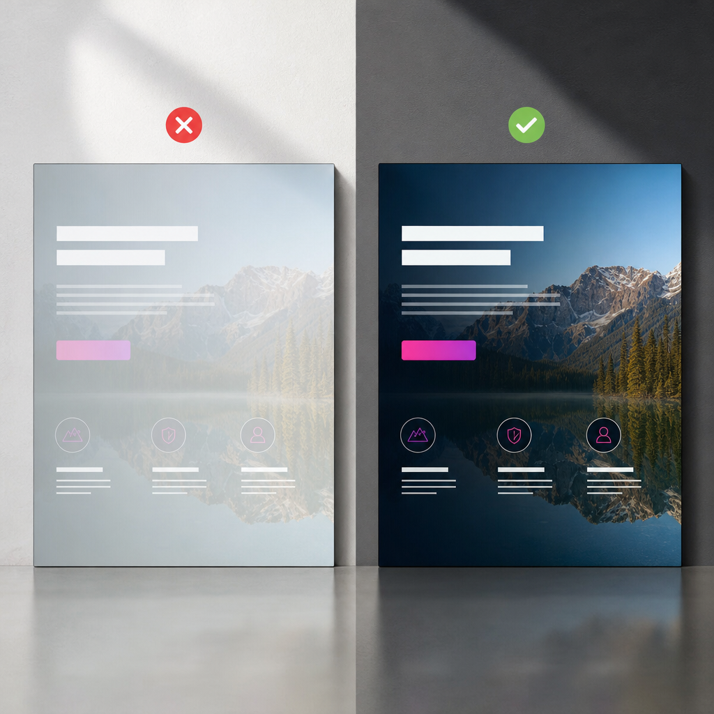
If a background image in a hero block or section does not provide enough contrast, the simplest solution is to add a dark overlay on top of it. However, many users reduce the opacity of the entire container. This makes not only the photo but also headings, buttons, icons, and other elements semi-transparent.
Elementor provides a dedicated tool for this purpose: Background Overlay. It adds a color or gradient over the background image while keeping the child content fully opaque. Below, we will cover the correct setup, responsive behavior, and common mistakes.
Why You Should Not Reduce the Container Opacity
The Opacity property applied to a container affects all of its content. For example, if you set the opacity to 70%, the same effect will apply to the background, text, buttons, card images, and all nested widgets.
As a result, the page loses contrast: the heading becomes harder to read, the button looks inactive, and the content colors blend into the background photo. This is especially noticeable on mobile devices, where the background image may be cropped and a bright or highly detailed area may appear behind the text.
An overlay works differently: it is positioned between the background image and the container content. This means only the photo is darkened, while the text and other elements retain their colors and full opacity.
- Do not use the container Opacity setting to darken its background.
- Do not confuse the transparency of the overlay color with the transparency of the container itself.
- Check contrast not only in the editor but also on the published page.
How to Add an Overlay in Elementor
The names of individual settings may vary slightly depending on the Elementor version, container type, or interface language. The overall setup process remains the same.
- Open the required container or section and go to the Style tab.
- In the Background block, select the classic background and add an image.
- If needed, adjust the image position, size, and repeat settings. For large hero blocks, Center Center position and Cover size are often used.
- Open the Background Overlay section.
- Choose a color and adjust its transparency using the alpha channel or slider.
- If you need a smooth transition, select a gradient instead of a solid color.
- Update the page and check that the text, buttons, and other elements remain fully opaque.
Which Overlay Color Should You Choose?
Black or a very dark neutral color usually works well with light text. For dark text, use a white overlay with low opacity. The overlay does not have to be gray: in some cases, a shade that matches the primary brand color is more appropriate.
Choose the overlay intensity based on the most difficult area of the image. If the background includes sky, faces, small text, or high-contrast objects, check the heading's readability directly over those areas.
- Light text — use a dark overlay.
- Dark text — use a light overlay.
- For branded sections — use a dark or colored shade with moderate transparency.
When to Use a Gradient Instead
A solid overlay darkens the entire photo evenly. This is convenient when the background has a uniform composition, but it is not always the best option for a hero block. If the text is positioned on the left and the main visual subject is on the right, uniform darkening may make the image unnecessarily dull.
In this situation, use a gradient: make it denser on the text side and more transparent toward the image. The text will have a clean, high-contrast background while the visual area remains visible.
The gradient direction should match the layout. For text on the left, a left-to-right transition is usually appropriate; for text on the right, use the opposite direction. If the content is centered, a radial or symmetrical gradient may work better.
- Do not make both gradient stops nearly opaque, as this turns the gradient into a solid dark overlay.
- Check the transition at different screen widths: after the background is cropped, the text may appear over a different part of the gradient.
- Do not use an overly bright gradient if it competes with the button or brand colors.
Responsive Overlay Settings for Tablets and Mobile Devices
The same background settings do not always work well on every device. On mobile screens, the background image is often displayed in a different proportion, and the Cover setting crops part of the photo. The text may end up over a brighter or more contrasting area.
Elementor lets you switch between devices in the settings and assign separate values for desktop, tablet, and mobile wherever a responsive option is available. If needed, change the transparency, gradient direction, or even the overlay color for narrower screens.
For example, a left-to-right gradient may be enough on a large screen, while mobile layouts often work better with uniform darkening because the text takes up more of the available width. This frequently produces a more stable result than trying to use one effect across all formats.
- Check the hero block on a wide monitor, tablet, and smartphone.
- Evaluate not only the color but also which part of the photo remains visible after cropping.
- Do not automatically copy desktop settings to mobile.
- After editing, check the page in a real browser rather than relying only on the editor's preview mode.
How to Check the Result and Readability
A correctly configured overlay should serve a practical purpose: it should make the content easier to understand, not simply darken the photo. Check the heading, description, links, and all buttons over the most contrasting and brightest areas of the background.
View the block at the page's normal scale. If you need to zoom in or strain to read the text, strengthen the overlay or change its direction. At the same time, excessive darkening reduces the role of the background image and can make the design feel heavy.
Also check button hover states, keyboard focus, and the mobile menu if they appear in the same block. The overlay should not reduce the visibility of interactive states.
- The text is easy to read without zooming.
- The button is clearly distinguishable from the background and has a noticeable hover state.
- The photo remains recognizable instead of becoming a solid dark area.
- The content does not become transparent after the background is changed.
- On mobile, the text does not overlap an excessively bright or busy area.
Common Elementor Overlay Mistakes
Even when Background Overlay is used correctly, the result can be poor because of additional styles or the container structure. Before adding CSS, check the basic settings and make sure the effect is applied to the correct level.
If the background is assigned to a parent container but the overlay is applied to a child container, the result may not look as expected. You should also check whether separate opacity has been set for a widget, column, image, or another nested element.
- Reducing the opacity of the entire container instead of changing the transparency of the overlay color.
- Using an overlay that is too weak, causing the text to disappear against a light background.
- Using an overlay that is too strong and completely hides the photo.
- Using one gradient without checking how it works on mobile.
- Adding unnecessary CSS even though the required effect is already available in Elementor settings.
- Editing the wrong container when the page contains nested sections with their own backgrounds.
Frequently asked questions
Will the text become transparent when I add a Background Overlay?
No. A background overlay affects the background image area, not the container's child widgets. Text, buttons, and cards remain fully opaque unless Opacity is set for them separately.
How is Background Overlay different from Opacity?
Opacity changes the transparency of the entire element, including its content. Background Overlay adds a color or gradient over the background image without changing the transparency of the content.
Can I create an overlay without CSS?
Yes. Elementor's background and Background Overlay settings are sufficient for standard darkening and gradient effects. Additional CSS may be needed only for custom effects or complex interactions.
Which overlay is best for a hero block?
When the text is positioned beside the main visual subject, a gradient with a denser color behind the text usually works best. For centered text or an uneven background, a uniform semi-transparent overlay may be more suitable.
Conclusion
To darken a background image in Elementor without reducing readability, do not change the opacity of the entire container. Add a color or gradient in the Background Overlay section so the effect is applied to the photo rather than the text and widgets.
For hero blocks, choose the gradient direction based on the content position, and check separate responsive settings for tablets and mobile devices. Then test contrast, buttons, and background cropping at real screen sizes.