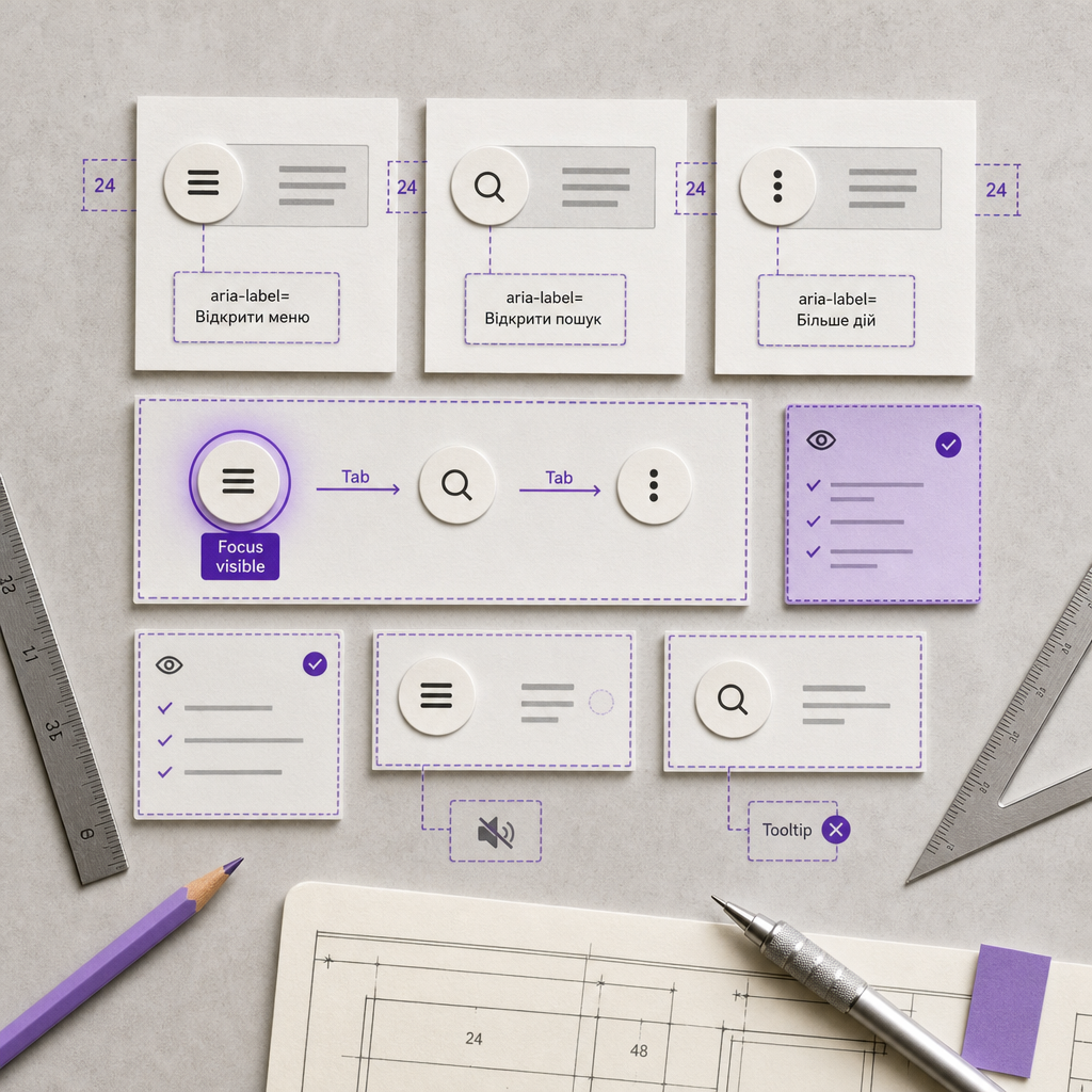
Icon-only buttons are often used for menus, search, closing modal windows, opening the shopping cart, or toggling a panel. Their purpose may be obvious to a sighted user, but a screen reader cannot always determine it from an image or SVG.
For an icon-only button to be understandable and operable, it needs an accessible name, correct semantics, and full keyboard support. In Elementor, you can configure these features without complex code by using widget attributes and checking the result in your browser.
Why Icons Without Text Need Additional Descriptions
A screen reader announces an element's accessible name rather than its visual appearance. A person may see a magnifying glass and understand that it opens search, but assistive software should not have to guess the purpose from a file name, class, or SVG shape.
If a button has no accessible name, a screen reader may announce it only as “button” or “link,” or may omit important information altogether. This creates difficulties not only for people with visual impairments, but also for users who navigate websites with a keyboard or use voice technologies.
An accessible name should describe the action, not the appearance of the icon. For example, “Open search” is more useful than “Magnifying glass,” and “Close menu” is better than “Cross.”
- Use a verb for the action: “Open menu,” “Close window,” or “Add to cart.”
- Avoid generic names such as “Click,” “Button,” or “Learn more” when the result is not clear from the context.
- Do not repeat a decorative icon in the accessible name: describe the function of the element instead.
How to Add aria-label in Elementor
Open the required button or icon widget in Elementor. In the settings panel, go to Advanced → Attributes and add a custom attribute using Elementor's format: the attribute name, a vertical bar, and its value.
For a menu button, the example would be: aria-label|Open menu. For a search button, it is better to use aria-label|Open search. After saving, inspect the page HTML or use your browser's developer tools to confirm that the attribute was added to the interactive element itself.
If a button already has visible text, a separate aria-label is usually unnecessary. A custom aria-label can replace the visible text for screen readers, so an incorrect value can make accessibility worse. For example, a visible “Save changes” button should not be renamed with aria-label to “Icon.”
- To open mobile navigation: aria-label|Open menu.
- For search: aria-label|Open search.
- To close a dialog: aria-label|Close window.
- To open the cart: aria-label|Open cart.
- For a profile button: aria-label|Open profile menu.
Distinguish Between a Button, a Link, and a Decorative Icon
An accessible name does not fix incorrect semantics. A button triggers an action on the current page: it opens a menu, displays search, toggles a state, or closes a window. A link takes the user to another URL. In Elementor, choose the appropriate element type instead of styling an ordinary link as a button without a good reason.
If an element opens a mobile menu, it should be a genuine button or another correctly managed interactive control. Users must be able to activate it with the Enter key or the Space key, as appropriate for the element type.
A decorative icon should not create unnecessary text for screen readers. If it only accompanies visible button text, it does not need a separate description. Do not add an aria-label to the decorative icon when the button already has an accessible name.
Pay particular attention to widgets where the icon and link may be separate elements. The aria-label must be placed on the HTML node that actually receives focus and is activated by the user.
- An action on the current page — use a button.
- A move to another page or URL — use a link.
- An icon without an independent function — use a decorative element.
- One action — one clear accessible name, without duplicating identical controls.
Check Keyboard Navigation
After adding aria-label, test the page without a mouse. Press Tab and check that focus reaches every interactive button and link. The navigation order should follow the page's logic: for example, the button that opens the menu should come first, followed by the items in the open navigation.
Focus must be visible against any background. Do not remove the default outline without providing a replacement. If the active state is almost invisible because of the design colors, users may lose track of their position on the page.
Open the menu or dialog with the keyboard and check its behavior. When a panel opens, users should be able to understand that the state has changed. When a modal window closes, focus should preferably return to the button that opened it. Implementing complex menus and dialogs may require additional JavaScript or a specialized accessible component.
- Navigate using only the Tab and Shift + Tab keys.
- Make sure focus does not disappear on dark or colored backgrounds.
- Test activation with Enter and the Space key.
- Do not use positive tabindex values to manually create a focus order.
- Check that hidden or closed elements are not still reachable with Tab.
.elementor-button:focus-visible { outline: 3px solid #1d4ed8; outline-offset: 3px; }Why a Tooltip Does Not Replace aria-label
A tooltip that appears when the pointer hovers over an element can help some users, but it is not a reliable accessible name. It may not appear during keyboard navigation, may be unavailable to a screen reader, or may disappear before the user has time to read it.
You can keep a tooltip as additional visual guidance, but the functional purpose of an icon-only button must be provided through aria-label or visible text.
How to Check the Result in a Browser
Start with a visual check: confirm that the button's purpose is clear, that its focus state is not clipped, and that another element does not cover its active area. Then open your browser's developer tools and locate the required element. Confirm that aria-label is placed on the button or link that receives focus.
Next, perform a manual keyboard test. This remains important even after an automated check because scanners do not always detect problems with focus order, menu-opening logic, or unclear labels.
For an additional check, use Lighthouse, axe, or another accessibility auditing tool. Analyze the results manually: the absence of aria-label warnings does not guarantee that the name is understandable or matches the action.
- Check the accessible name in the browser's accessibility tree.
- Make sure the button does not have an empty aria-label.
- Test the page on a narrow screen, where menus and icons often become interactive.
- Repeat the test after caching and HTML optimization if the site uses performance plugins.
Common Configuration Mistakes
The most common mistake is describing the icon instead of the action. The name “Hamburger” does not explain what will happen after activation, while “Magnifying glass” may be unclear without context. It is better to use “Open menu” and “Open search.”
Another issue is duplicating accessible text. If a button has visible text such as “Search” and the nested icon also receives its own name, a screen reader may announce unnecessary or repeated information.
Do not hide all focus styles for the sake of a minimalist design. Also, do not make a button accessible only through mouse hover: hover does not work for keyboard users or touch-device users.
Finally, do not add aria-label to a non-interactive container in the hope that it will become a button. The attribute describes an element, but does not give it behavior, focus, or click handling.
- Poor: “Click,” “Icon,” or “Hamburger.”
- Better: “Open menu,” “Open search,” or “Close window.”
- Do not use accessibility attributes as a substitute for visual contrast and a visible focus state.
- After changing a button's text, check the translations and mobile version again.
Frequently asked questions
Do I need to add aria-label to every button in Elementor?
No. aria-label is primarily needed for buttons without visible text or for elements whose purpose is not clear from the existing text. A button with a clear visible label usually already has an accessible name.
Which aria-label should I use for a search icon?
Use a specific description of the action: “Open search” if the button opens a search field or panel. If it immediately runs a search, the name could be “Run search” or another description that matches its actual behavior.
Can I use a tooltip instead of aria-label?
No. A tooltip can supplement the interface, but it is not a reliable accessible name for screen readers and keyboard navigation.
How can I hide a decorative icon from a screen reader?
If the icon has no independent meaning, do not give it a separate accessible name. For complex cases, check how Elementor outputs the SVG or image and, if necessary, use aria-hidden="true" on the decorative element without hiding the button itself.
What should I do if a button has aria-label but cannot receive focus?
Check whether it is a genuine button or link, whether it has tabindex="-1", whether another block is covering it, and whether it is hidden in its current state. aria-label describes an element, but does not add keyboard behavior by itself.
Conclusion
An accessible icon-only button in Elementor consists of more than an icon. It should have a clear accessible name, appropriate semantics, a visible focus state, and predictable keyboard navigation.
Add aria-label through Advanced → Attributes, describe the action with specific words, and check the result in the browser without using a mouse. This short audit will make the interface clearer for screen readers and more usable for everyone.