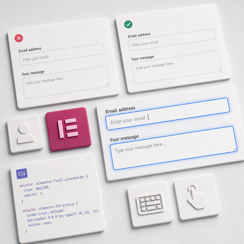
A placeholder is a short hint displayed inside a form field. It can show the expected data format or provide an example, but it should not be the user's only explanation. When placeholder text disappears after data is entered, users lose the context of what they need to provide.
In Elementor, form accessibility depends on more than the placeholder's color. You should keep labels visible, provide sufficient contrast, add a clear focus state, and test the form with a keyboard and on smaller screens. Below is a practical way to configure these elements using the widget's Custom CSS.
How a Placeholder Differs from a Label
A label is the permanent name of a field: “Name,” “Email,” or “Phone number.” A placeholder is a temporary hint or example, such as “Alex” or “name@example.com.” After the user starts typing, the placeholder usually disappears, while the label remains as a clear reference.
Do not hide the label and leave only a placeholder inside the field. This approach makes it harder to review a form, can confuse users with cognitive or visual disabilities, and may reduce the effectiveness of assistive technologies. The label should be associated with its corresponding field through Elementor and remain available to screen readers.
- Use the label to identify the field and explain its purpose.
- Use the placeholder for an example or data format.
- Do not duplicate a long instruction in the placeholder.
- For required fields, use clear identification and an understandable error message.
How to Style the Placeholder and Focus State in Elementor
If your Elementor edition provides a Custom CSS field for the Form widget, open the widget settings and add the styles at the widget level. The selector limits the CSS to this form, so the rules will not change every form on the site.
The example below makes the placeholder darker, removes its excessive transparency, and adds a blue indicator when the field receives focus. You can adapt the color and shadow to match your brand, but do not sacrifice contrast for a decorative effect.
selector .elementor-field::placeholder {
  color: #6b7280;
  opacity: 1;
}

selector .elementor-field:focus {
  border-color: #2563eb;
  box-shadow: 0 0 0 3px rgba(37, 99, 235, .15);
  outline: none;
}
What Each Rule Does
The ::placeholder pseudo-element changes the appearance of the hint only in fields that contain one. The opacity: 1 property is needed because browsers may automatically display placeholder text with reduced opacity.
The :focus pseudo-class applies when the field is active, such as after a click or when the user reaches it with the Tab key. Changing the border color and adding a box-shadow makes it easier to see where the user currently is.
In this example, outline is disabled because it is replaced with a custom visible indicator. Do not remove the outline unless the field has a clear alternative focus indicator for keyboard navigation.
- Check that the blue border is clearly visible against the page background.
- Do not rely only on a color change: an additional shadow or a thicker border makes the focus state easier to understand.
- If the theme or other styles already provide a strong focus effect, avoid conflicts and check the final appearance in the browser.
What Placeholder Text Should Be Like
A good placeholder is short and specific. It explains the expected response format rather than repeating the entire label. For example, “+380 67 123 45 67” is suitable for a “Phone number” field, while “Briefly describe your task” works for a “Message” field.
Do not use the placeholder for mandatory legal terms, long instructions, or several rules at once. Place this information below or beside the label so it remains visible after the user starts typing.
The color #6b7280 is an example of a sufficiently distinct gray for a light background, but the actual contrast depends on the field color, theme, and interface state. Check it with a dedicated tool or built-in accessibility testing features.
- Good: “name@example.com” for an Email field.
- Good: “Enter a number with the country code” for a phone field.
- Poor: “Enter your email address, which we will use to contact you” in a narrow field.
- Poor: very light gray text that nearly blends into the background.
- Do not place information in the placeholder that users need to remember while completing several fields.
Testing the Form with a Keyboard
After adding the CSS, test the form without a mouse. Press Tab and check whether focus moves in a logical order: from the first field to the next ones and then to the submit button. The visual indicator should be visible on every interactive element.
Try entering data, deleting it, moving backward with Shift + Tab, and correcting an error. This can reveal whether focus is lost, the border becomes invisible, or the error message is not connected to the correct field.
- Make sure Tab does not move to hidden or inactive elements.
- Check the focus state for text fields, select elements, checkboxes, and other form controls.
- Do not identify the active field only by color if that color is difficult to distinguish.
- After an error, check that users can understand which field needs to be corrected.
What to Check on Mobile Devices
On a smartphone, a placeholder may be truncated because of the field's limited width or an increased font size. Open the page on a real device or use responsive preview mode, and check every field in portrait orientation.
When the on-screen keyboard appears, it should not cover the active field. Also check that the tap target and spacing between fields are large enough, and that the blue focus border remains visible against a colored or image-based background.
- Check long placeholders in phone, address, and message fields.
- Make sure the label does not disappear because of responsive styles.
- Test the form in portrait and, when necessary, landscape orientation.
- Check autofill: automatically inserted data should not make the text difficult to read.
Common Mistakes When Styling a Form
The most common mistake is hiding the label to make the form look minimalist. Although this may appear neat visually, users lose context once they start typing. It is better to keep the label and work with spacing, font size, and the hierarchy of elements.
Another issue is using global CSS such as input::placeholder without limiting it to a specific form. This can change the search form, comment form, popup, or other theme components. In the widget's Custom CSS, use selector; for global styling, use a separate class assigned to the specific form.
You should also avoid removing the field border in the focus state without providing a replacement. If users cannot see where the cursor is, keyboard navigation becomes more difficult.
- Do not use an excessively light placeholder.
- Do not make the placeholder the field's only label.
- Do not style every input on the site unless necessary.
- Do not test the form only in the Elementor editor.
- Remember to test hover, focus, validation errors, and the filled state.
Frequently asked questions
Can I use a placeholder instead of a label in an Elementor form?
It is not recommended. A placeholder disappears after text is entered and does not provide a permanent explanation of the field's purpose. Keep the label visible and use the placeholder only as a short hint or example.
Why does the placeholder look too light even when a color is specified?
Browsers often apply reduced opacity to placeholder text. Add opacity: 1 and check whether other theme styles have higher specificity and are overriding your rule.
Is it necessary to add outline: none?
No. You should remove it only when another highly visible focus indicator is provided, such as a border and box-shadow. If the alternative indicator is not clear enough, keep the outline.
Why should I use selector in Elementor Custom CSS?
selector limits the CSS to the current widget. This prevents the placeholder and focus styles from being applied accidentally to other forms, theme fields, or third-party plugin elements.
Is testing the form on desktop enough?
No. Test it with a keyboard and on a mobile device. On a small screen, the placeholder may be truncated, focus may be difficult to see, and the keyboard may cover the active field.
Conclusion
An accessible placeholder is more than gray text inside a field. It should complement a visible label, remain readable, and support—not obstruct—the form-filling process.
For Elementor, you can locally style the placeholder and focus state through the widget's Custom CSS using selector. Afterward, be sure to test the form with a keyboard, on mobile devices, and in different states: empty, focused, filled, and showing a validation error.